


# Dynamic Views
Repeaters work well for limited and static sets of data, but in the real world, models are commonly more complex – and larger. Here, a smarter solution is needed. For this, Qt Quick provides the ListView and GridView elements. These are both based on a Flickable area, so the user can move around in a larger dataset. At the same time, they limit the number of concurrently instantiated delegates. For a large model, that means fewer elements in the scene at once.

The two elements are similar in their usage. We will begin with the ListView and then describe the GridView with the former as the starting point of the comparison. Notice that the GridView places a list of items into a two-dimensional grid, left-to-right or top-to-bottom. If you want to show a table of data you need to use the TableView which is described in the Table Models section.
The ListView is similar to the Repeater element. It uses a model, instantiates a delegate and between the delegates, there can be spacing. The listing below shows how a simple setup can look.
import QtQuick
import "../common"

Background {
    width: 80
    height: 300

    ListView {
        anchors.fill: parent
        anchors.margins: 20
        clip: true
        model: 100
        delegate: GreenBox {
            required property int index
            width: 40
            height: 40
            text: index
        }
        spacing: 5
    }
}
If the model contains more data than can fit onto the screen, the ListView only shows part of the list. However, as a consequence of the default behavior of Qt Quick, the list view does not limit the screen area within which the delegates are shown. This means that delegates may be visible outside the list view and that the dynamic creation and destruction of delegates outside the list view is visible to the user. To prevent this, clipping must be activated on the ListView element by setting the clip property to true. The illustration below shows the result of this (left view), compared to when the clip property is false (right view).

To the user, the ListView is a scrollable area. It supports kinetic scrolling, which means that it can be flicked to quickly move through the contents. By default, it also can be stretched beyond the end of contents, and then bounces back, to signal to the user that the end has been reached.
The behavior at the end of the view is controlled using the boundsBehavior property. This is an enumerated value and can be conimaged from the default behavior, Flickable.DragAndOvershootBounds, where the view can be both dragged and flicked outside its boundaries, to Flickable.StopAtBounds, where the view never will move outside its boundaries. The middle ground, Flickable.DragOverBounds lets the user drag the view outside its boundaries, but flicks will stop at the boundary.
It is possible to limit the positions where a view is allowed to stop. This is controlled using the snapMode property. The default behavior, ListView.NoSnap, lets the view stop at any position. By setting the snapMode property to ListView.SnapToItem, the view will always align the top of an item with its top. Finally, the ListView.SnapOneItem, the view will stop no more than one item from the first visible item when the mouse button or touch was released. The last mode is very handy when flipping through pages.
# Orientation
The list view provides a vertically scrolling list by default, but horizontal scrolling can be just as useful. The direction of the list view is controlled through the orientation property. It can be set to either the default value, ListView.Vertical, or to ListView.Horizontal. A horizontal list view is shown below.
import QtQuick
import "../common"

Background {
    width: 480
    height: 80

    ListView {
        anchors.fill: parent
        anchors.margins: 20
        spacing: 4
        clip: true
        model: 100
        orientation: ListView.Horizontal
        delegate: GreenBox {
            required property int index
            width: 40
            height: 40
            text: index
        }
    }
}
As you can tell, the direction of the horizontal flows from the left to the right by default. This can be controlled through the layoutDirection property, which can be set to either Qt.LeftToRight or Qt.RightToLeft, depending on the flow direction.
# Keyboard Navigation and Highlighting
When using a ListView in a touch-based setting, the view itself is enough. In a scenario with a keyboard, or even just arrow keys to select an item, a mechanism to indicate the current item is needed. In QML, this is called highlighting.
Views support a highlight delegate which is shown in the view together with the delegates. It can be considered an additional delegate, only that it is only instantiated once, and is moved into the same position as the current item.
In the example below this is demonstrated. There are two properties involved for this to work. First, the focus property is set to true. This gives the ListView the keyboard focus. Second, the highlight property is set to point out the highlighting delegate to use. The highlight delegate is given the x, y and height of the current item. If the width is not specified, the width of the current item is also used.
In the example, the ListView.view.width attached property is used for width. The attached properties available to delegates are discussed further in the delegate section of this chapter, but it is good to know that the same properties are available to highlight delegates as well.
import QtQuick
import "../common"

Background {
    width: 240
    height: 300

    ListView {
        id: view

        anchors.fill: parent
        anchors.margins: 20

        focus: true

        model: 100
        delegate: numberDelegate
        highlight: highlightComponent

        spacing: 5
        clip: true
    }

    Component {
        id: highlightComponent

        GreenBox {
            width: ListView.view ? ListView.view.width : 0
        }
    }

    Component {
        id: numberDelegate

        Item {
            id: wrapper

            required property int index

            width: ListView.view ? ListView.view.width : 0
            height: 40

            Text {
                anchors.centerIn: parent
                font.pixelSize: 10
                text: wrapper.index
            }
        }
    }
}
When using a highlight in conjunction with a ListView, a number of properties can be used to control its behavior. The highlightRangeMode controls how the highlight is affected by what is shown in the view. The default setting, ListView.NoHighlightRange means that the highlight and the visible range of items in the view not being related at all.
The value ListView.StrictlyEnforceRange ensures that the highlight is always visible. If an action attempts to move the highlight outside the visible part of the view, the current item will change accordingly, so that the highlight remains visible.
The middle ground is the ListView.ApplyRange value. It attempts to keep the highlight visible but does not alter the current item to enforce this. Instead, the highlight is allowed to move out of view if necessary.
In the default configuration, the view is responsible for moving the highlight into position. The speed of the movement and resizing can be controlled, either as a velocity or as a duration. The properties involved are highlightMoveSpeed, highlightMoveDuration, highlightResizeSpeed and highlightResizeDuration. By default, the speed is set to 400 pixels per second, and the duration is set to -1, indicating that the speed and distance control the duration. If both a speed and a duration is set, the one that results in the quickest animation is chosen.
To control the movement of the highlight more in detail, the highlightFollowCurrentItem property can be set to false. This means that the view is no longer responsible for the movement of the highlight delegate. Instead, the movement can be controlled through a Behavior or an animation.
In the example below, the y property of the highlight delegate is bound to the ListView.view.currentItem.y attached property. This ensures that the highlight follows the current item. However, as we do not let the view move the highlight, we can control how the element is moved. This is done through the Behavior on y. In the example below, the movement is divided into three steps: fading out, moving, before fading in. Notice how SequentialAnimation and PropertyAnimation elements can be used in combination with the NumberAnimation to create a more complex movement.
Component {
    id: highlightComponent

    Item {
        width: ListView.view ? ListView.view.width : 0
        height: ListView.view ? ListView.view.currentItem.height : 0

        y: ListView.view ? ListView.view.currentItem.y : 0

        Behavior on y {
            SequentialAnimation {
                PropertyAnimation { target: highlightRectangle; property: "opacity"; to: 0; duration: 200 }
                NumberAnimation { duration: 1 }
                PropertyAnimation { target: highlightRectangle; property: "opacity"; to: 1; duration: 200 }
            }
        }

        GreenBox {
            id: highlightRectangle
            anchors.fill: parent
        }
    }
}
# Header and Footer
At each end of the ListView contents, a header and a footer element can be inserted. These can be considered special delegates placed at the beginning or end of the list. For a horizontal list, these will not appear at the head or foot, but rather at the beginning or end, depending on the layoutDirection used.
The example below illustrates how a header and footer can be used to enhance the perception of the beginning and end of a list. There are other uses for these special list elements. For instance, they can be used to keep buttons to load more contents.
import QtQuick
import "../common"

Background {
    width: 240
    height: 300

    ListView {
        anchors.fill: parent
        anchors.margins: 20

        clip: true

        model: 4
        delegate: numberDelegate
        header: headerComponent
        footer: footerComponent

        spacing: 2
    }

    Component {
        id: headerComponent

        YellowBox {
            width: ListView.view ? ListView.view.width : 0
            height: 20
            text: 'Header'

        }
    }

    Component {
        id: footerComponent

        YellowBox {
            width: ListView.view ? ListView.view.width : 0
            height: 20
            text: 'Footer'
        }
    }

    Component {
        id: numberDelegate

        GreenBox {
            required property int index

            width: ListView.view.width
            height: 40

            text: 'Item #' + index
        }
    }
}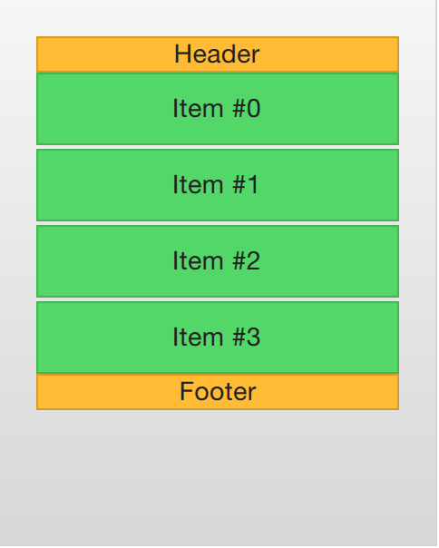
TIP
Header and footer delegates do not respect the spacing property of a ListView, instead they are placed directly adjacent to the next item delegate in the list. This means that any spacing must be a part of the header and footer items.
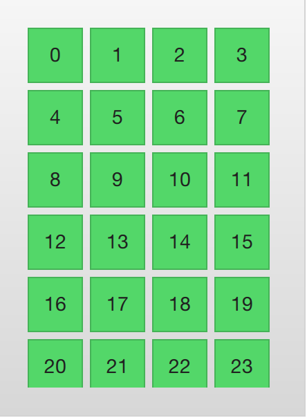
# The GridView
Using a GridView is very similar to using a ListView. The only real difference is that the grid view places the delegates in a two-dimensional grid instead of in a linear list.
Compared to a list view, the grid view does not rely on spacing and the size of its delegates. Instead, it uses the cellWidth and cellHeight properties to control the dimensions of the contents delegates. Each delegate item is then placed in the top left corner of each such cell.
import QtQuick
import "../common"

Background {
    width: 220
    height: 300

    GridView {
        id: view
        anchors.fill: parent
        anchors.margins: 20

        clip: true

        model: 100

        cellWidth: 45
        cellHeight: 45

        delegate: GreenBox {
            required property int index
            width: 40
            height: 40
            text: index
        }
    }
}
A GridView contains headers and footers, can use a highlight delegate and supports snap modes as well as various bounds behaviors. It can also be orientated in different directions and orientations.
The orientation is controlled using the flow property. It can be set to either GridView.LeftToRight or GridView.TopToBottom. The former value fills a grid from the left to the right, adding rows from the top to the bottom. The view is scrollable in the vertical direction. The latter value adds items from the top to the bottom, filling the view from left to right. The scrolling direction is horizontal in this case.
In addition to the flow property, the layoutDirection property can adapt the direction of the grid to left-to-right or right-to-left languages, depending on the value used.
← Basic Models Delegate →