May 5, 2023
In Qt 6.5, Qt Quick Controls' Material style received an update to Material 3, the latest version of Google’s open-source design system.
This post will highlight the changes made to each control so that you can adapt your applications accordingly. It will also highlight more general changes and new API, such as the new Material.containerStyle and Material.roundedScale attached properties.
General changes
Filled and outlined containers
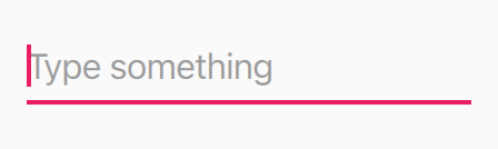
TextArea and TextField now support the two different appearances: outlined and filled. This can be configured with the Material.containerStyle attached property.
|
 |
| Old Material TextField. | New Material 3 outlined and filled TextField. |
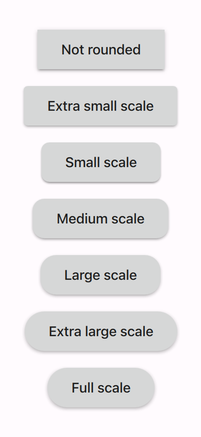
Rounded corners
Several controls' corners became rounder. This can be configured with the Material.roundedScale attached property.
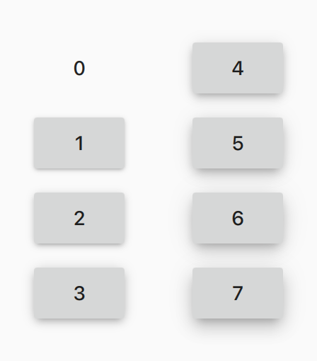
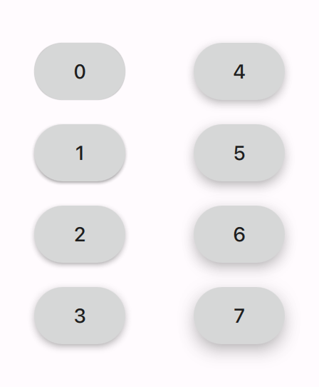
Elevation shadows
The elevation drop shadow effect was improved in order to better match the Material 3 guidelines.
 |
 |
| Old Material elevations. | New Material 3 elevations. |
Controls
While we've tried to list most of the relevant changes, not all of them are listed here. To see the previous implementations of the Material controls (to, for example, see previous property values), take a look at the Material directory in Qt 6.4. Some changes (such as bindings for things like elevation or padding) are a little too complex to mention here, so it's best to use that link if you're in doubt about how to restore the previous appearance and/or behavior.
ApplicationWindow
ApplicationWindow's background color changed:
 |
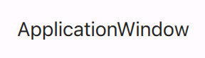 |
| Old Material ApplicationWindow. | New Material 3 ApplicationWindow. |
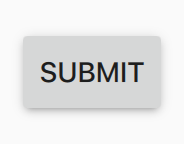
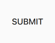
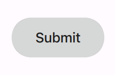
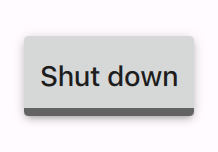
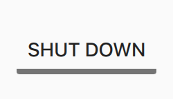
Button
 |
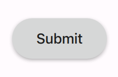 |
| Old Material Button. | New Material 3 Button. |
 |
 |
| Old Material Button with zero elevation. | New Material 3 Button with zero elevation. |
|
|
| Old Material Button in unchecked and checked states. | New Material 3 Button in unchecked and checked states. |
- Corners are now rounded (Material.FullScale). To revert to the old corners, set the Material.roundedScale attached property to Material.ExtraSmallScale.
- The indicator that was shown for checkable buttons was removed, since it no longer looks good with fully rounded corners. Instead, checked buttons now use the accent color for their text. Highlighted buttons are the exception, as it would result in a lack of contrast between the background and the text.
- Padding, spacing and other layout values were updated to match Material 3 guidelines.
- In Qt 6.5.1, button text is no longer all uppercase. To revert to the old case, set font.capitalization to Font.AllUppercase.
ComboBox
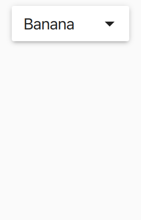 |
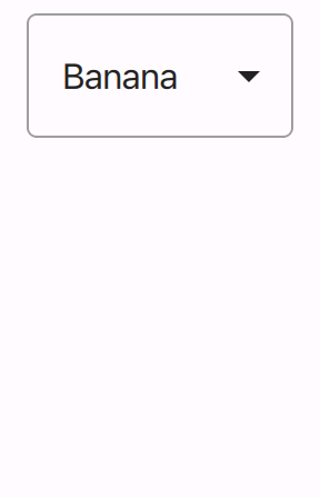 |
| Old Material ComboBox. | New Material 3 ComboBox. |
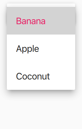 |
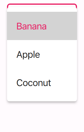 |
| Old Material 3 ComboBox popup. | New Material 3 ComboBox popup. |
- The background is now outlined rather than filled.
- Elevation was decreased to 0. This can be changed by setting Material.elevation to the desired value.
- The popup's vertical padding has increased, its corners rounded and elevation lowered.
DelayButton
 |
 |
| Old Material DelayButton. | New Material 3 DelayButton. |
|

|
| Old Material DelayButton with zero elevation. | New Material 3 DelayButton with zero elevation. |
In Qt 6.5.1, text is no longer all uppercase. To revert to the old case, set font.capitalization to Font.AllUppercase.
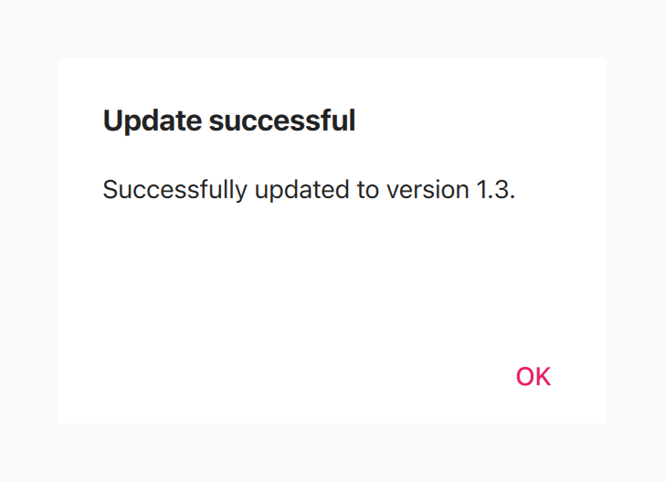
Dialog
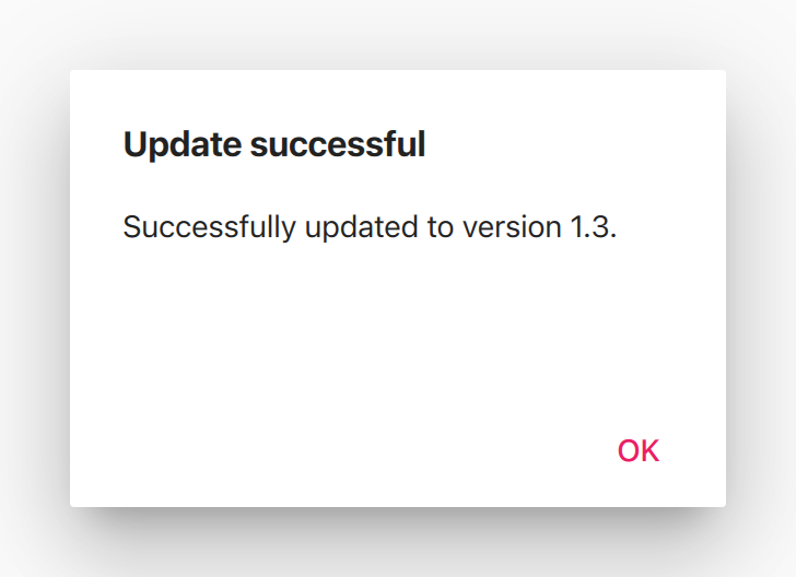 |
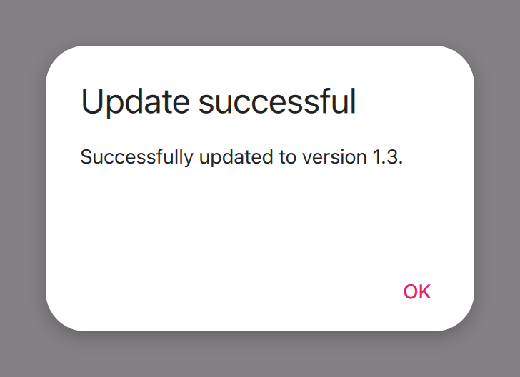 |
| Old Material Dialog. | New Material 3 Dialog. |
 |
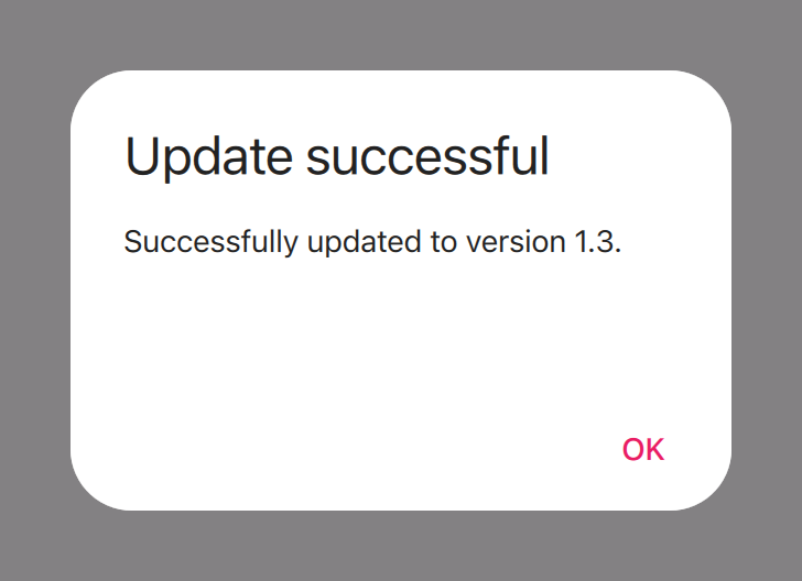 |
| Old Material Dialog with zero elevation. | New Material 3 Dialog with zero elevation. |
- Dialog is now modal. Set modal to false to revert to the old behavior and appearance.
- Corners are now rounded (Material.ExtraLargeScale). Set to Material.NotRounded to revert to the old appearance.
- Top padding was increased.
- Elevation was decreased.
- Title font size was increased.
DialogButtonBox
Corners are now rounded (Material.ExtraLargeScale).Drawer
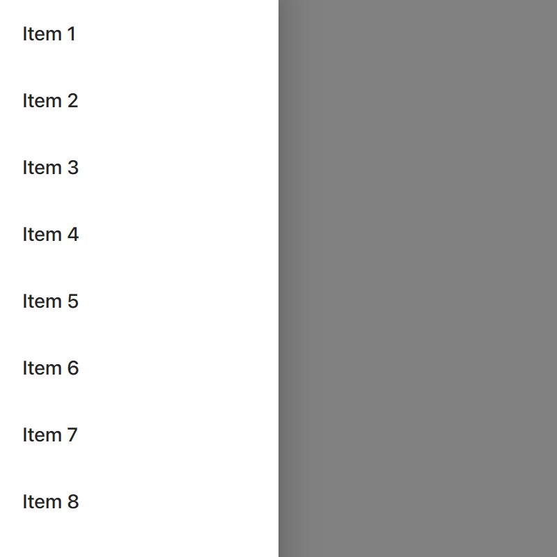 |
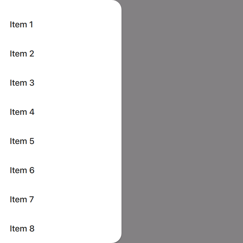 |
| Old Material Drawer. | New Material 3 Drawer. |
- Corners are now rounded (Material.LargeScale).
- Elevation was decreased.
Menu
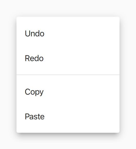 |
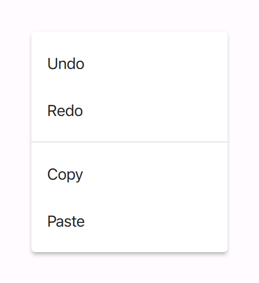 |
| Old Material Menu. | New Material 3 Menu. |
Elevation was decreased. Set to 8 to revert to the old appearance.
Popup
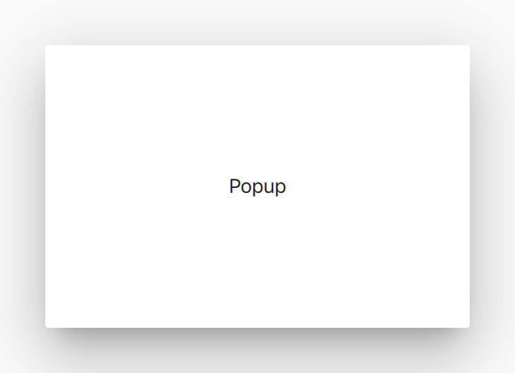
|
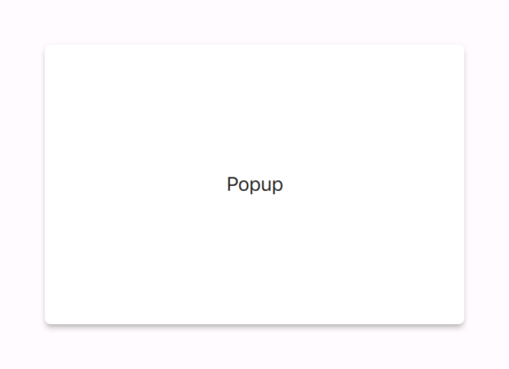
|
| Old Material Popup. | New Material 3 Popup. |
- Elevation was decreased.
- Rounded corner radius was slightly increased (Material.ExtraSmallScale).
RangeSlider
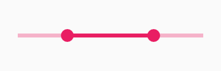 |

 |
| Old Material RangeSlider. | New Material 3 RangeSlider with tickmarks. |
- Tick marks were added when stepSize is a non-zero value that is divisible by the difference between to and from, snapMode is SnapAlways and the number of tick marks that would be rendered is less than the width to height ratio, or vice versa for vertical sliders.
- The grow animation that plays when the handle is pressed has been removed.
Slider
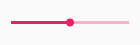 |
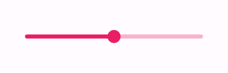
|
| Old Material Slider. | New Material 3 Slider with tickmarks. |
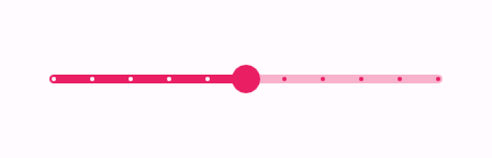
See RangeSlider.
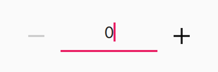
SpinBox
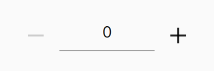 |
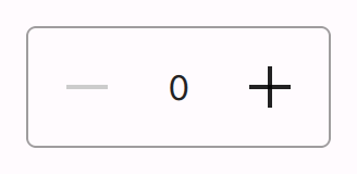 |
| Old Material SpinBox. | New Material 3 SpinBox. |
 |
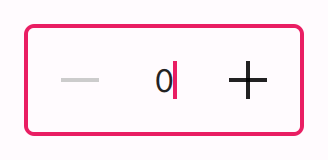 |
| Old Material SpinBox with focus. | New Material 3 SpinBox with focus. |
The background is now outlined rather than filled.
Switch
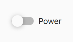 |
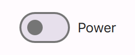 |
| Old Material Switch. | New Material 3 Switch. |
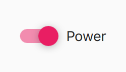 |
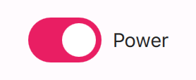 |
| Old checked Material Switch. | New checked Material 3 Switch. |
Indicator visuals were changed.
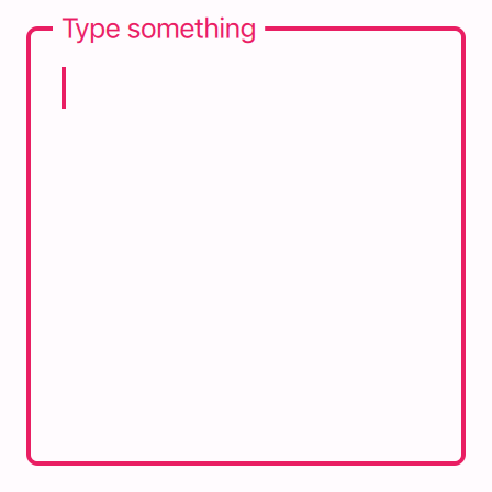
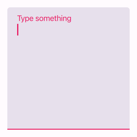
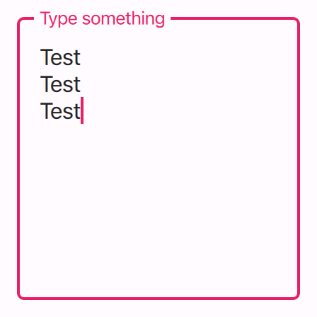
TextArea
|
|
| Old Material TextArea. | New Material 3 outlined and filled TextArea. |
|
 |
| Old Material TextArea with focus. | New Material 3 outlined and filled TextArea with focus. |
|
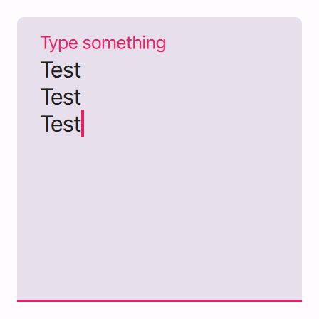 |
| Old Material TextArea with focus and text. | New Material 3 outlined and filled TextArea with focus and text. |
- Background is now outlined by default. This behavior can be configured with the Material.containerStyle attached property.
- Placeholder text now floats at the top of the control when it has focus or text.
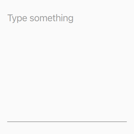
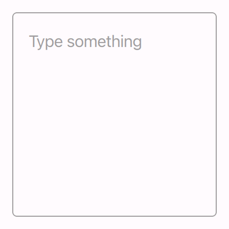
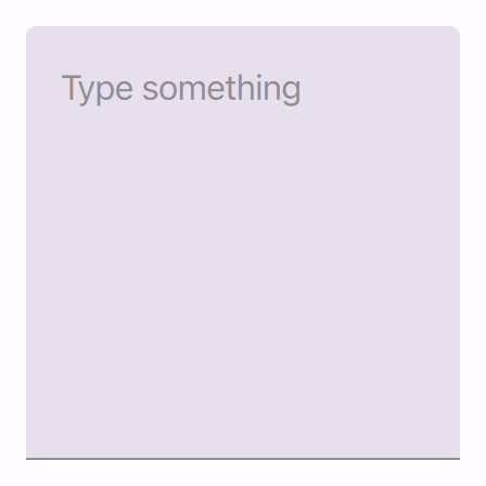
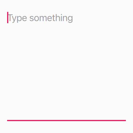
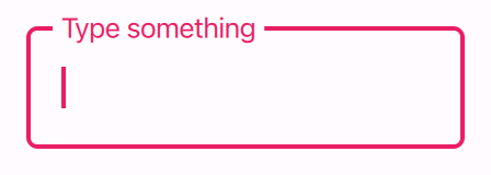
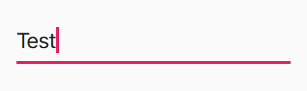
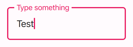
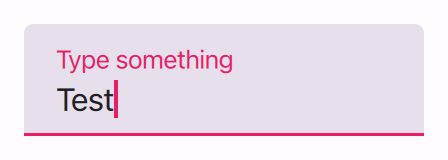
TextField
|
|
| Old Material TextField. | New Material 3 outlined and filled TextField. |
|
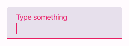 |
| Old Material TextField with focus. | New Material 3 outlined and filled TextField with focus. |
|
 |
| Old Material TextField with focus and text. | New Material 3 outlined and filled TextField with focus and text. |
- Background is now outlined by default. This behavior can be configured with the Material.containerStyle attached property.
- Placeholder text now floats at the top of the control when it has focus or text.
Known issues & feedback
- Material TextArea placeholder text incorrectly clipped
- Material TextArea delegate cursor not clipped when in Flickable
Slider and RangeSlider did get support for the value label/popup, but it was left out for now until we can come up with an API to control whether or not it's shown.
If you find issues with the Material 3 changes, please report them against the "Quick Controls: 2" component in Jira.