Sep 20, 2022
Introduction
Qt Quick Controls 2 applications provide a native look and feel for several target platforms by using styles such as the macOS, Windows, or the Material style for Android. This has so far not been the case for iOS. QQC2 applications running on iOS did not look native and developers had to manually customise the controls or create their own style in order to give their UIs a more native look.
Those days are now over as the new iOS style is joining the list of built-in styles to for Qt Quick Controls 2!
The iOS Style is a native-looking style for iOS. It is based on pixmaps and designed to look and feel as similar as possible to the native controls in UIKit. To achieve this, most of the controls use 9-patch images to draw their components and use QML to add animations. We chose a pixmap-based approach, as opposed to using native APIs like we do for the macOS and Windows style, in order to have a style that is easier to maintain, opens up for more animations, and that is not subject to visual regressions resulting from periodic updates and changes in iOS. This also means that over time the controls can deviate from the controls in UIKit, and will therefore need regular design updates from our side.
Controls
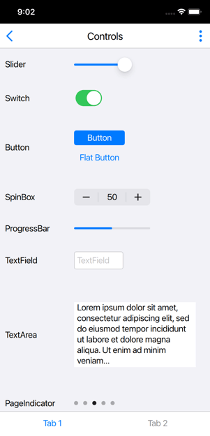
Most of the controls have a similar look and feel to the UIKit controls. However, there are slight differences. Below is a general description of some of the controls as compared to the iOS native ones.
Button
In iOS 15 the UIButton comes with a configuration API that allows the developer to select between different stylings for the button. The iOS style supports two of those stylings: the plain one, which draws no background, and the filled one, which draws a background filled with a solid colour. The filled look is the default, but users can choose the plain style by setting the flat property of the button to true.
SpinBox
The SpinBox also provides a custom look by incorporating a text field inside, which is missing in the correlative UIStepper. Nevertheless, it feels at home on iOS.
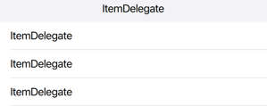
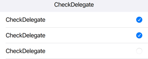
Delegates
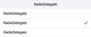
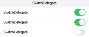
Delegates correspond to views in iOS. Each delegate draws a background similar to the Table View Cell in iOS and make use of the respective indicators. The CheckDelegate and the SwitchDelegate use the same indicator as the CheckButton and the Switch controls respectively, but the RadioDelegate unlike the RadioButton, uses a checkmark that resembles the one used in iOS when selecting an option from a list.
Controls that are missing in UIKit
Qt Quick Controls 2 comes with a large set of controls, some of which do not have a similar component in UIKit. For these controls, we chose to provide a custom look, inspired and based on other native components in iOS.
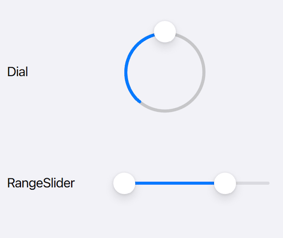
Dial & RangeSlider
The Dial and RangeSlider use the same image assets as the Slider component giving them a look that feels “at-home” in iOS, despite them being non-native controls (see image below).
CheckBox
In UIKit, the native component for a toggle widget is the UISwitch. For the iOS style, we decided to provide a checkbox component to keep a similar cross-platform behaviour as well as to allow users to set the tristate property which is configurable for the CheckBox in QQC2.
RadioButton
Similarly, we opted for a custom look for the radio buttons even though a radio button in native iOS applications is most often represented by a checkmark.
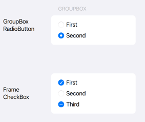
Frame & GroupBox
The Frame and GroupBox controls are also missing in UIKit but their look for the iOS style is inspired by UIKit’s grouped Table View style with rounded corners.
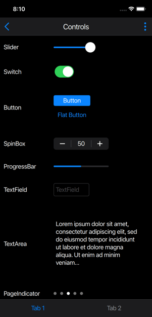
Themes
The iOS style supports both the light and dark theme. They are set accordingly based on the system/application-wide configurations.
Using the Style
The style is used just like any other style in Qt Quick Controls 2. It can be selected at compile-time by explicitly importing the style:
import QtQuick.Controls.iOS
or alternatively, let the style be resolved at runtime by importing the QtQuick.Controls module and setting the style via one of the following approaches:
-
The
-stylecommand line argument -
The
QT_QUICK_CONTROLS_STYLEenvironment variable -
The
qtquickcontrols2.confconfiguration file
Once the iOS style becomes a fully-supported feature, Qt Quick Controls 2 applications running on iOS will run with the iOS style by default.
The style is available both on iOS and macOS, making it easy to develop Quick UIs on macOS! The style should look the same on both platforms, besides minor differences that may occur due to variations in available system fonts and font rendering engines.
Tech Preview
The iOS style is in Tech-preview for 6.4, which means that development is still ongoing. Not all of the controls are ported yet. The missing controls include BusyIndicator, ComboBox, DelayButton, Dialog, DialogButtonBox, SelectionRectangle, Tumbler and ToolTip.
To see how a Qt Quick Controls 2 iOS app looks like with the iOS style, make sure to check out the Qt To Do List example available on the App Store: https://apps.apple.com/sa/app/qt-to-do-list/id1635946835


