May 12, 2023
The Problem
Qt has (almost) been here since the dawn of graphical user interfaces, being released just 5 years after Windows 3.0. Needless to say, technologies, expectations and duties for an UI toolkit evolved substantially over the years. Organizing and layouting of visual elements like buttons is one of those duties that changed significantly: From small screens with few pixels and fixed size embedded apps we came a long way to high resolution screens and handheld devices of all form factors. The changes in design philosophy are even more dramatic. Applications need to look and feel good on many devices as well as in different configurations, landscape and portrait, windowed and full screen. More than that, they need to be able to switch seamlessly between those modes.
The longevity of Qt is remarkable and would not have been possible without constantly reviewing and updating existing APIs. This is an exercise we conducted recently with the layouting system. The layouting system of Qt stayed basically the same over a long time, only slightly extended by QtQuick, its anchoring concept and some adaptions for high-dpi devices. We wanted to know if this system still conforms to the demands of modern UIs and workflows. This is also a good opportunity to look at other technologies and frameworks, in particular HTML and CSS, Material/Flutter and Microsoft's Fluent to see what they do different or even better. We are curious about any concepts that cannot be implemented in QML and eager to fill these gaps. In order to identify any gaps in our API and to find the best practice with Qt layouts, we implemented many examples from those frameworks in QML. In the following we present some of the outcomes to give you an update on how we think of layouts and where the future could lead to. We hope to inspire some of you and collect feedback on the current system, our thoughts and ideas for the future. If you are passionate about Qts layout system, this is the opportunity to raise your voice and let us hear your opinion!
HTML and CSS Inspired Responsive Layouting
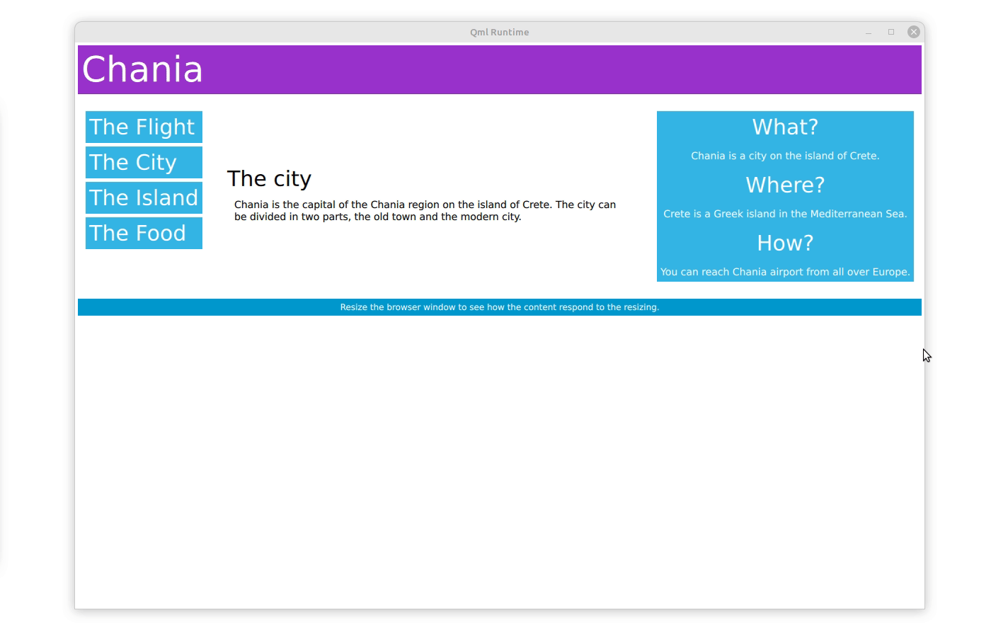
Responsive layouts plays a big role in web design and this technology can provide a good source of inspiration. An interesting concept is the clear separation of content (HTML) and appearance (CSS stylesheets). This gives great flexibility, since one can easily change the layout (in CSS) in order to adapt to different screen sizes, while not having to alter the HTML content hierarchy. How this plays out in practice can be seen in the responsive web design tutorial of w3school. The example is straight forward: HTML tags are used to create a hierarchy of different elements. The visual representation of these elements, including their size and positioning, is described in the CSS stylesheet, depending on the device and in particular its width. The w3school example uses a 12-column layout with three vertical areas: The left area covers three columns, the middle area covers 6 columns, and the right area covers the remaining three columns. When the screen is below 768 pixels, it will make all three areas 100% wide, such that they appear beneath each other. The first layout makes great use of large devices in landscape format, the latter works well on small devices or in portrait mode.
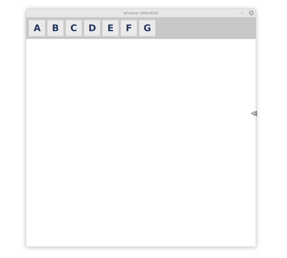
How do the Qt layouts compare to this? The first thing we must consider is the separation of content and layout. There is no dedicated language for styling like CSS in Qt, but we have our one-for-all scripting language QML, that we can use for the content as well as for the layout. We can also, to some extent, declare them in separate places: First, we define our contents and the hierarchy with declarative QML. On top of our hierarchy there is a GridLayout with three columns. The header and the bottom items span the complete width of the window and therefore occupy three columns. Between the header and bottom there are three columns of items. This matches the description of the content from the responsive w3school example.
All that is missing is the description of the layout by the CSS part of the w3school example. An elegant way to do this in QML are states, modifying the layout, depending on the device or window width. We need two states, representing the narrow, vertical oriented layout and the wide, horizontal oriented layout. For the narrow layout, we let all columns occupy the whole width and therefore set their column span to three, corresponding to 100% as in the CSS example. The grid layout in Qt behaves the same way as CSS and automatically puts items in the next row if there is not enough space in the current row (flow layout), making the blocks of items appear beneath each other. In the wide layout, we can fit all columns next to each other, which can be achieved by setting their column span to one. The example on w3school continues to add a third intermittent state, but also this can be done easily with QML, simply adding another state.
GridLayout {
    anchors.left: parent.left
    anchors.right: parent.right
    columns: 3
    states: [
        State {
            when: window.width <= 600
            PropertyChanges { target: leftBox; Layout.columnSpan: 3 }
            PropertyChanges { target: contentBox; Layout.columnSpan: 3 }
            PropertyChanges { target: rightBox; Layout.columnSpan: 3 }
        },
        State {
            when: window.width > 600 && window.width <= 768
            PropertyChanges { target: leftBox; Layout.columnSpan: 1 }
            PropertyChanges { target: contentBox; Layout.columnSpan: 1 }
            PropertyChanges { target: rightBox; Layout.columnSpan: 2 }
        },
        State {
            when: window.width > 768
            PropertyChanges { target: leftBox; Layout.columnSpan: 1 }
            PropertyChanges { target: contentBox; Layout.columnSpan: 1 }
            PropertyChanges { target: rightBox; Layout.columnSpan: 1 }
        }
    ]
    ...

    ColumnLayout {
        id: leftBox
        ...
    }
    ColumnLayout {
        id: contentBox
        ...
    }
    ColumnLayout {
        id: rightBox
        ...
    }
    ...
}
The full code can be accessed here and runs with Qt6.5.
Both CSS and QML layouts are flexible and some experimenting showed that we can create complex responsive layouts with both. The CSS stylesheet is replaced by a state machine in QML, which provides some form of separation. Naturally, being well accommodated to Qt and very foreign to the web world, I prefer the latter for its flexibility and additional functionality: Instead of relying on a uniform width as in CSS, the Qt layout can make some smarter decisions, based on its content.
Improving the QML Layout: Align:Justify?
Is there a possibility to make the Qt experience better? We think so, yes. Looking at the example, we simply changed the layout from a three column wide layout to a single column layout. Changing the column span of several items to implement this seems complicated and unintuitive, when apparently just the number of columns changed from three to one. So here is an even simpler solution, omitting any states, simply changing the number of columns:
GridLayout {
    anchors.left: parent.left
    anchors.right: parent.right
    columns: (window.width > 768)? 3 : 1;
    ...
}
This solution works well when there are only two states and if these states represent the edge-cases of fully horizontal or vertical layouts. In the example with three states, it is difficult to find combinations of column spans and number of columns where the layout makes sense and leaves no blank spots.
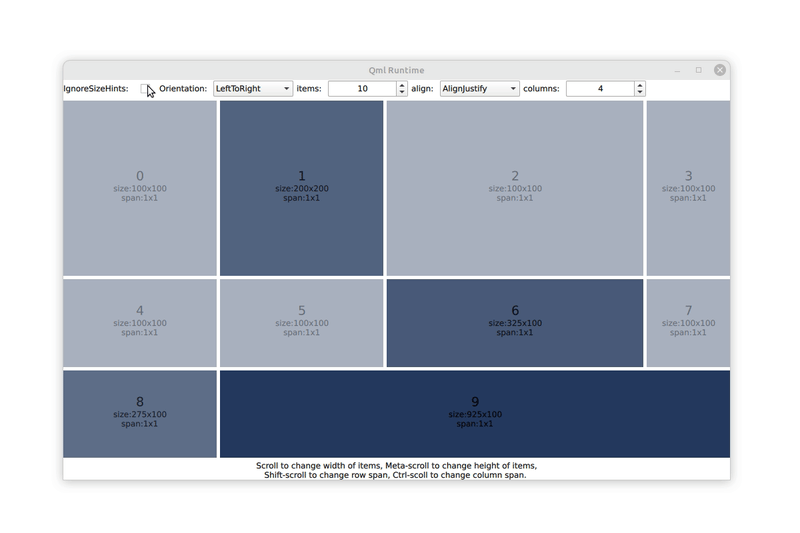
In an effort to make the responsive layouts possible with even the simplest code, we tried to extend the QML Layout class to avoid such blank spaces. The idea was to extend the layout with an additional property, that we call flowAlignment for now. This property allows the layout to reposition and stretch items when there is free space available. Like setting a text, we want to position items to the left, right or center and maybe want to stretch them to fill up the whole row. The flowAlignment property can take all these states and the layout will move the items accordingly. The align justify mode is the solution to the issue mentioned above, and probably the most useful case; but in an attempt to use a familiar and complete API, we also implemented the rest. With this change we can implement a reasonable responsive layout in few lines of code:
GridLayout {
    flowAlignment: GridLayout.AlignJustify // new property
    anchors.left: parent.left
    anchors.right: parent.right
    columns: (window.width > 768)? 3 : (window.width > 600)? 2 : 1;
    ...
}
It looks just like the example above with three states. The full example code can be accessed here but requires a patch for Qt6.5 to run. We also provide an example to play around with various item sizes and alignment flags that looks like this:
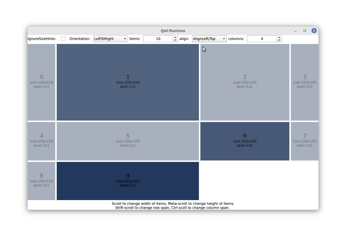
We think this addition increases the flexibility of responsive layouts substantially. It allows to change the number of columns and rows quickly without worrying or even thinking about filling up all lines. A nice side effect is, that we can make smart decisions at runtime when expanding items to fulfill the align-justify rule and increase the size of the item with the largest preferred size. Unfortunately, this addition has to live deep in the existing layout class and will require a patch and recompiling of Qt.
Material and Flutter
Material is the dominant design language on Android devices and Google apps, and it comes with a strong opinion on how layouts should be. Qt supports Android and it should therefore support the design language for this platform. Aside from that, Material provides a lot of great ideas and inspiration. So maybe we can even learn a thing or two for the benefit of all other platforms.
The (now outdated but still interesting) Material1 Design provides an interesting concept for layouts: Everything is arranged in a rigid grid of twelve equally sized columns, a concept that is also popular in web design. To our surprise, this super simple concept cannot be created easily in Qt, because our layouts try to be smart and therefore do not like uniform widths, at least not without setting it individually on every item. However, making something less smart is usually not that difficult, and we could easily dumb down our layouts with a new flag, that we called uniformCellSize for now. With this flag it is very easy to make a layout of twelve equally sized columns and recreate the responsive layouts as suggested by Material1 (of course with state machines to alter the appearance). Might this be a good addition to our layouts? After all, the concept of uniform column widths was dropped in the newer versions of Material, which might indicate that is was not the best idea to start with. We have two patches, here and here for this new property, so take it for a ride and tell us what you think!
The example from above lets you also play around with this property:
Material3 and Adaptive Scaffold
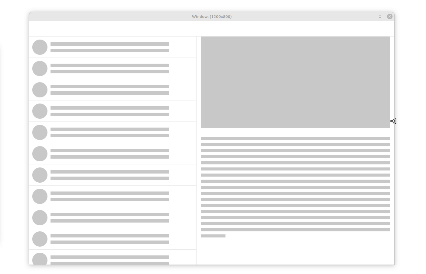
The renewed Material3 adaptive layout drops the rigid grid and suggests a different approach, based on various navigation bars and bodies. Android's in-house toolkit Flutter provides an implementation of this layouting concept called adaptive scaffold. As an exercise we tried to recreate the respective example with the layouts available in Qt.
Using states as before, we can recreate this example, changing columns and rows, turning items visible and invisible, changing parents and layouts, creating multiple instances of the same button at different positions. But is it pretty? Absolutely not, so we tried to come up with a better solution. The idea is to have multiple layouts where one of them is activated depending on the screen size. To not define the same button multiple times, we added minimalistic items that can be used as placeholder. We call it LayoutItemProxy for now. Items themselves can be defined in an arbitrary place of the QML file and used by many proxies in many different layouts. If a layout and a LayoutProxyItem therein are visible, the proxy will take over the items position and size and control its visibility. It will also act as the items parent to make sure that events are delivered appropriately and that the drawing order of the layout makes sense. The other way around, the LayoutProxyItem will forward the preferred size and all other relevant layout properties of the item to the layout (we are still working on figuring out which properties are relevant). Further, we can set additional Layout parameters on the Proxy. This way we can define multiple layouts for different devices, full of LayoutProxyItems. Depending on the device or the current window size, we can show and hide layouts and the corresponding LayoutItemProxies will pull the items in the correct place. A prototype for the LayoutItemProxy and some demonstration examples can be found in [this patch].
The example of the adaptive scaffold boils down to defining all items that we will need at some point with an arbitrary parent and at an arbitrary point in the QML hierarchy. We continue with definitions of the layouts for compact, medium and large devices, full of LayoutItemProxy targeting the actual items. Adding a small helper component to control the visibility of layouts following the device or window size finishes the example.
Once the LayoutProxyItem was in place, this example was fairly simple to write in QML. It is also a very flexible concept which we tried to demonstrate in the example with various nested structures, a mix of real and proxy items and even a Flickable. Some care has to be given when looking for parent items (avoid using parent in an item that is targeted by a proxy) but generally speaking everything should behave as normal since we simply reposition the item with the proxy.
LayoutChooser {
    id: layoutChooser
    width: parent.width
    height: parent.height

    layoutChoices: [
        smallLayout,
        mediumLayout,
        largeLayout
    ]

    criteria: [
        width < 700,
        width > 1000,
        true
    ]

    MyButton {
        id: articlesButton
        objectName: "articlesButton"
        iconId: 0xef42 // see https://fonts.google.com/icons
    }

    // more buttons

    Repeater { // many more items
        id: rep
        model: 12
        Rectangle {
            color: '#ffc9c5'
            implicitHeight: width
            implicitWidth: 256
            Layout.fillWidth: true
            Layout.fillHeight: true
        }
    }

    property Item smallLayout: ColumnLayout {
        height: parent.height
        width: parent.width
        Repeater {
            model: 2
            LayoutItemProxy { target: rep.itemAt(index) }
        }
        RowLayout {
            Layout.fillHeight: false
            Layout.fillWidth: true
            LayoutItemProxy { target: inboxButton }
            LayoutItemProxy { target: articlesButton }
            LayoutItemProxy { target: chatButton }
            LayoutItemProxy { target: videoButton }
        }
    }

    property Item mediumLayout: ColumnLayout {
    ... // define medium layout with LayoutItemProxies
    }

    property Item largeLayout: ColumnLayout {
    ... // define large layout with LayoutItemProxies
    }

    ...
}

Using this concept we should also be able to provide an adaptive scaffold class with Qt, facilitating application developers with their responsive layouts. However, both the LayoutProxyItem and a hypothetical adaptive scaffold can live happily in the application code base, so there might be no need to provide this with Qt. This feature is also widely independent of the rest of the layout API, making it easy to maintain. Another positive aspect is, that animations as shown in the flutter example can be added at a single point, namely the LayoutProxyItem for all items. Again, we invite you to play around with the example and the code to see whether you like or what you are missing.
By the way: We needed to replicate the Material icons for this example. This was fairly easy using a FontLoader and the Material3 icon font. See the example for details.
Microsoft and Fluent
Last, we take a look at how Microsoft suggests to do responsive layouts in their design concept Fluent. Microsoft breaks responsive layouts down to six concepts: Reposition, Resize, Reflow, Show/hide, Replace and Re-architect and shows an example for each. We implemented these examples with the techniques showed before, relying widely on the LayoutProxyItem. Here are the more interesting examples for:
It was pretty easy to implement these examples with QML. Specific behavior like the Show/hide example has to be implemented manually by the application developer but we do not see the requirement of including these specifics into the Qt codebase right now.
Wrap up
So these are our current ideas for responsive layouts. Generally, we think that Qt is well suited for most problems and we could implement many examples with simple state machines. Changing the hierarchy of the layout as shown in the Adaptive Scaffold example and Re-architecture concept of Fluent is currently not well represented in the QtQuick API and required the addition of a LayoutProxyItem. We are curious to hear from you what you think of this solution and whether you want to see more of it. Do you want it to be part of Qt or would you be happy to copy some example code into your application? We also added two more APIs to simplify the solution to other issues, namely the flowAlignment and uniformCellSize properties. We are equally curious to hear from you what you think about those.
Another interesting aspect that we discovered during this exercise is that most frameworks provide higher level APIs for responsive layouts (Flutter has adaptive scaffold, Fluent NavigationView), closer to the API of QMainWindow and its toolbars than to QtQuick. Would you like to see such an API coming to QtQuick as well or are you happy to set this up yourself? Would you rely on a third party providing this high level API or do you think it should be integrated in Qt itself?
Do you know of any other concept for layouts that you would like to see reflected in the QtQuick API? Do you have any more complex cases that we do not cover with the examples shown here? Leave us a comment or a link below and we promise to have a look at it.


