2017年07月15日
この記事は The Qt Blog の Let There Be Shapes! を翻訳したものです。
執筆: Laszlo Agocs, 2017年7月7日
次の Qt 5.10 の新機能の一つとして Qt Quick に shape プラグインを追加しました。これにより、直線や二次曲線、三次曲線、弧などからなる線や図形などのパスを Qt Quick に追加することが可能になりました。もちろん、これまでも QQuickPaintedItem や Canvas 上で実現は可能でしたが、Shapeは Qt Quick の純正のエレメントで、シーングラフ的には実際のジオメトリもしくはベンダー固有の GPU のパスの描画機能(GL_NV_path_rendering) にて処理がなされます。
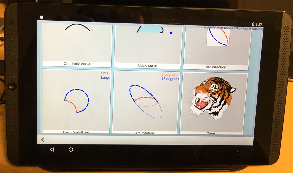
Android タブレット上での Shape のサンプルプログラム
これのなにがすごいの?
- CPU による(QImage や OpenGL FBO への)描画処理の必要がなくなるので、高解像度のディスプレイを含む比較的広いエリアにこういった描画をしていたり、移動や回転などのアニメーションによる再描画が多発していた場合にとても効果を発揮します。
- API は完全に宣言的で、stroke や fill パラメータ、パスエレメントの座標、コントロールポイントなどのすべてのプロパティが QML の表現で書け、Qt Quick の普通の方法でアニメーションさせることも可能です。宣言的に書くことで、プロパティの変更による影響が依存する箇所のみ自動で再計算されることも、(QPainter などの)すべてを再計算する伝統的なプログラミングに対するメリットになります。
- Qt Quick エレメント側の API は1つですが、裏側ではいくつかの実装が存在しています。デフォルトの汎用のソリューションは QtGui の OpenGL バックエンドを利用した QPainter による実装です。NVIDIA の GPU 向けには GL_NV_path_rendering を利用した実装を提供しています。Qt Quick がソフトウェアレンダラーで描画を行っている場合は、QPainter を利用したシンプルなバックエンドが採用されます。将来的に他の実装も追加できるような仕組みになっています。
現在の状況とドキュメント
ちょうどこの機能が qtdeclarative の dev ブランチのマージされたところで、今後生成される 5.10 ブランチに入ります。スナップショットのドキュメントもオンラインで参照できるようになりました。
(ドキュメントシステムのちょっとした問題で、Particles のいくつかの型が Inherited By セクションや他の場所にクロスリンクされていますが、あまり気にしないでください。)
標準のサンプルプログラムは shapes と呼ばれ、declarative/examples/quick の下に置かれています。
実際のコードを見てみましょう
余計なことは気にせずに、コードの一部を見てみましょう。パスの指定には PathView 用の既存のエレメントを再利用します。問題ないですね?残りの部分はコードの見た目通りです。(前出のドキュメントも参照してください)
1. ストローク幅と塗りつぶし色をアニメーションさせたシンプルなトライアングル
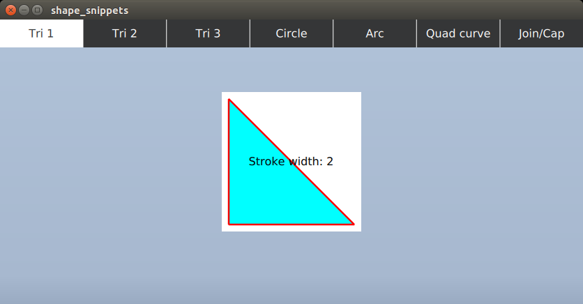
Shape {

    id: tri

    anchors.fill: parent
    ShapePath {

        id: tri_sp

        strokeColor: "red"

        strokeWidth: 4

        SequentialAnimation on strokeWidth {

            running: tri.visible

            NumberAnimation { from: 1; to: 20; duration: 2000 }

            NumberAnimation { from: 20; to: 1; duration: 2000 }

        }

        ColorAnimation on fillColor {

            from: "blue"; to: "cyan"; duration: 2000; running: tri.visible

        }
        startX: 10; startY: 10

        PathLine { x: tri.width - 10; y: tri.height - 10 }

        PathLine { x: 10; y: tri.height - 10 }

        PathLine { x: 10; y: 10 }

    }

}
2. 次は塗りつぶしなしの点線です。QImage を利用したやり方とは違い、変形の際の問題はありません。
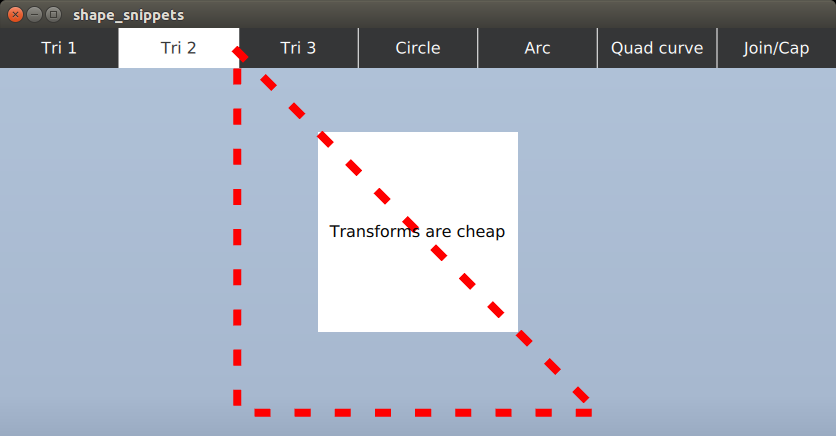
Shape {

    id: tri2

    anchors.fill: parent
    ShapePath {

        strokeColor: "red"

        strokeWidth: 4

        strokeStyle: ShapePath.DashLine

        dashPattern: [ 1, 4 ]

        fillColor: "transparent"
        startX: 10; startY: 10

        PathLine { x: tri2.width - 10; y: tri2.height - 10 }

        PathLine { x: 10; y: tri2.height - 10 }

        PathLine { x: 10; y: 10 }

    }
    SequentialAnimation on scale {

        running: tri2.visible

        NumberAnimation { from: 1; to: 4; duration: 2000; easing.type: Easing.InOutBounce }

        NumberAnimation { from: 4; to: 1; duration: 2000; easing.type: Easing.OutBack }

    }

}
3. 線形のグラデーションの Shape です。これは QPainter の世界での QLinearGradient と同じように動きます。
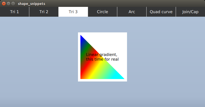
Shape {

    id: tri3

    anchors.fill: parent
    ShapePath {

        strokeColor: "transparent"
        fillGradient: LinearGradient {

            x1: 20; y1: 20

            x2: 180; y2: 130

            GradientStop { position: 0; color: "blue" }

            GradientStop { position: 0.2; color: "green" }

            GradientStop { position: 0.4; color: "red" }

            GradientStop { position: 0.6; color: "yellow" }

            GradientStop { position: 1; color: "cyan" }

        }
        startX: 10; startY: 10

        PathLine { x: tri3.width - 10; y: tri3.height - 10 }

        PathLine { x: 10; y: tri3.height - 10 }

        PathLine { x: 10; y: 10 }

    }
    NumberAnimation on rotation {

        from: 0; to: 360; duration: 2000

        running: tri3.visible

    }

}
4. 円や楕円も見てみましょう。2つの弧を使います。(通常の円や楕円の場合は2つの PathArc をもつ一つの ShapePath を使いましょう。ここでは異なる fill パラメータを使うので2つの ShapePath を使っています。)
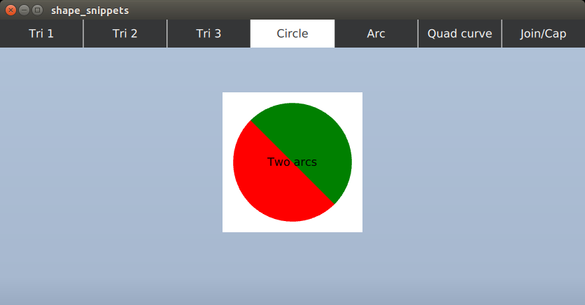
Shape {

    id: circle

    anchors.fill: parent

    property real r: 60
    ShapePath {

        strokeColor: "transparent"

        fillColor: "green"
        startX: circle.width / 2 - circle.r

        startY: circle.height / 2 - circle.r

        PathArc {

            x: circle.width / 2 + circle.r

            y: circle.height / 2 + circle.r

            radiusX: circle.r; radiusY: circle.r

            useLargeArc: true

        }

    }

    ShapePath {

        strokeColor: "transparent"

        fillColor: "red"
        startX: circle.width / 2 + circle.r

        startY: circle.height / 2 + circle.r

        PathArc {

            x: circle.width / 2 - circle.r

            y: circle.height / 2 - circle.r

            radiusX: circle.r; radiusY: circle.r

            useLargeArc: true

        }

    }

}
5. 弧で使われる PathArc は SVG の楕円弧を元に設計されました。Qt 5.10 では一つだけ足りなかった xAxisRotation プロパティが追加されています。
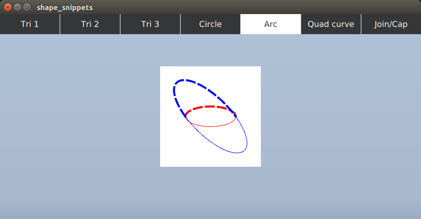
Repeater {

    model: 2

    Shape {

        anchors.fill: parent
        ShapePath {

            fillColor: "transparent"

            strokeColor: model.index === 0 ? "red" : "blue"

            strokeStyle: ShapePath.DashLine

            strokeWidth: 4
            startX: 50; startY: 100

            PathArc {

                x: 150; y: 100

                radiusX: 50; radiusY: 20

                xAxisRotation: model.index === 0 ? 0 : 45

            }

        }

    }

}
Repeater {

    model: 2

    Shape {

        anchors.fill: parent
        ShapePath {

            fillColor: "transparent"

            strokeColor: model.index === 0 ? "red" : "blue"
            startX: 50; startY: 100

            PathArc {

                x: 150; y: 100

                radiusX: 50; radiusY: 20

                xAxisRotation: model.index === 0 ? 0 : 45

                direction: PathArc.Counterclockwise

            }

        }

    }

}
6. 3次曲線と4次ベジエ曲線も普通に使えます。以下のサンプルでは3次曲線のコントロールポイントをアニメーションさせています。
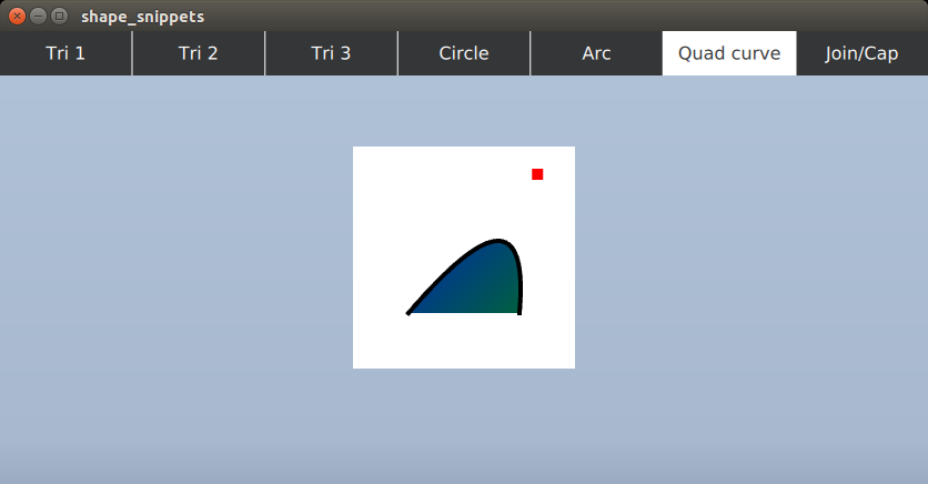
Shape {

    id: quadCurve

    anchors.fill: parent
    ShapePath {

        strokeWidth: 4

        strokeColor: "black"

        fillGradient: LinearGradient {

            x1: 0; y1: 0; x2: 200; y2: 200

            GradientStop { position: 0; color: "blue" }

            GradientStop { position: 1; color: "green" }

        }
        startX: 50

        startY: 150

        PathQuad {

            x: 150; y: 150

            controlX: quadCurveControlPoint.x; controlY: quadCurveControlPoint.y

        }

    }

}
Rectangle {

    id: quadCurveControlPoint

    color: "red"

    width: 10

    height: 10

    y: 20

    SequentialAnimation on x {

        loops: Animation.Infinite

        NumberAnimation {

            from: 0

            to: quadCurve.width - quadCurveControlPoint.width

            duration: 5000

        }

        NumberAnimation {

            from: quadCurve.width - quadCurveControlPoint.width

            to: 0

            duration: 5000

        }

    }

}
7. QPainter や QPen でもお馴染みの通常の join や cap のスタイルも利用できます。
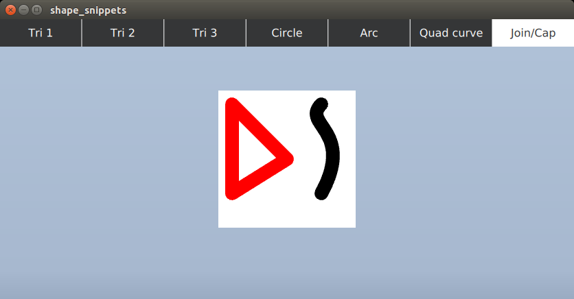
Shape {

    anchors.fill: parent
    ShapePath {

        strokeColor: "red"

        strokeWidth: 20

        fillColor: "transparent"

        joinStyle: ShapePath.RoundJoin
        startX: 20; startY: 20

        PathLine { x: 100; y: 100 }

        PathLine { x: 20; y: 150 }

        PathLine { x: 20; y: 20 }

    }
    ShapePath {

        strokeColor: "black"

        strokeWidth: 20

        capStyle: ShapePath.RoundCap
        startX: 150; startY: 20

        PathCubic {

            x: 150; y: 150; control1X: 120; control1Y: 50; control2X: 200

            SequentialAnimation on control2Y {

                loops: Animation.Infinite

                NumberAnimation { from: 0; to: 200; duration: 5000 }

                NumberAnimation { from: 200; to: 0; duration: 5000 }

            }

        }

    }

}
気をつけることは?
これによって何百もの線や曲線や弧を Qt Quick に追加できるようになったのでしょうか?
そういうわけでもありません。
ユーザーインターフェースのデザインに数多くのシェイプを取り入れる前に、パフォーマンスについても考慮しましょう。詳細は Shape のドキュメント を参照してください。
わかりやすく簡単にまとめると、
- 【汎用のバックエンド】たくさんの ShapePath からなる Shape はジオメトリの生成に時間がかかります。asynchronous プロパティを true にすることで、その名の通り UI の動作をブロックすることなしに専用のスレッドでこの処理が行われるようになります。
- 【GL_NV_path_rendering バックエンド】ジオメトリの生成の問題は存在しませんが、”foreign” 描画コマンドが Qt Quick のシーングラフに組み込まれている関係で、膨大な数の Shape エレメントが存在する際のスケーラビリティに問題があります。これは一般的なジオメトリベースのシーングラフノードとは事なり、膨大な量の計算と OpenGL の状態変更が伴うからです。ちなみに多くの ShapePath を含む Shape が1つだけの場合は、シーングラフ的には1つのノードになるため、この問題は発生しません。
- アンチエイリアスはマルチサンプリングとスーパーサンプリングのみがサポートされていて、シーン全体や layer に対して適用可能です。Qt 5.10 では layer.samples というとても便利なプロパティが追加 され、簡単にマルチサンプルの描画を(バックエンドが対応している場合に)行えるようになりました。
- Shape は既存の Rectangle が提供する矩形や角丸矩形の代替ではありません。Rectangle は常にパフォーマンスがよく、マルチサンプルを有効にすることなしに、ある程度のアンチエイリアスが可能になっています。
色々書きましたが、Shape は多くの Qt Quick アプリケーションでとても便利にお使いいただける機能だと思います。Qt 5.10 のリリースは、、、今年の後半です。楽しみにしていてください!

