

Responsive UI design is a great way to adopt user interfaces for different display sizes and layouts. A few popular web pages do not use a responsive design. But is a responsive design all we need to create a delightful and meaningful customer experience? Instead of adjusting the UI layout based on available display real estate, shouldn't we rather tailor it according to user preferences of different types of users?
What Is Responsive UI Design?
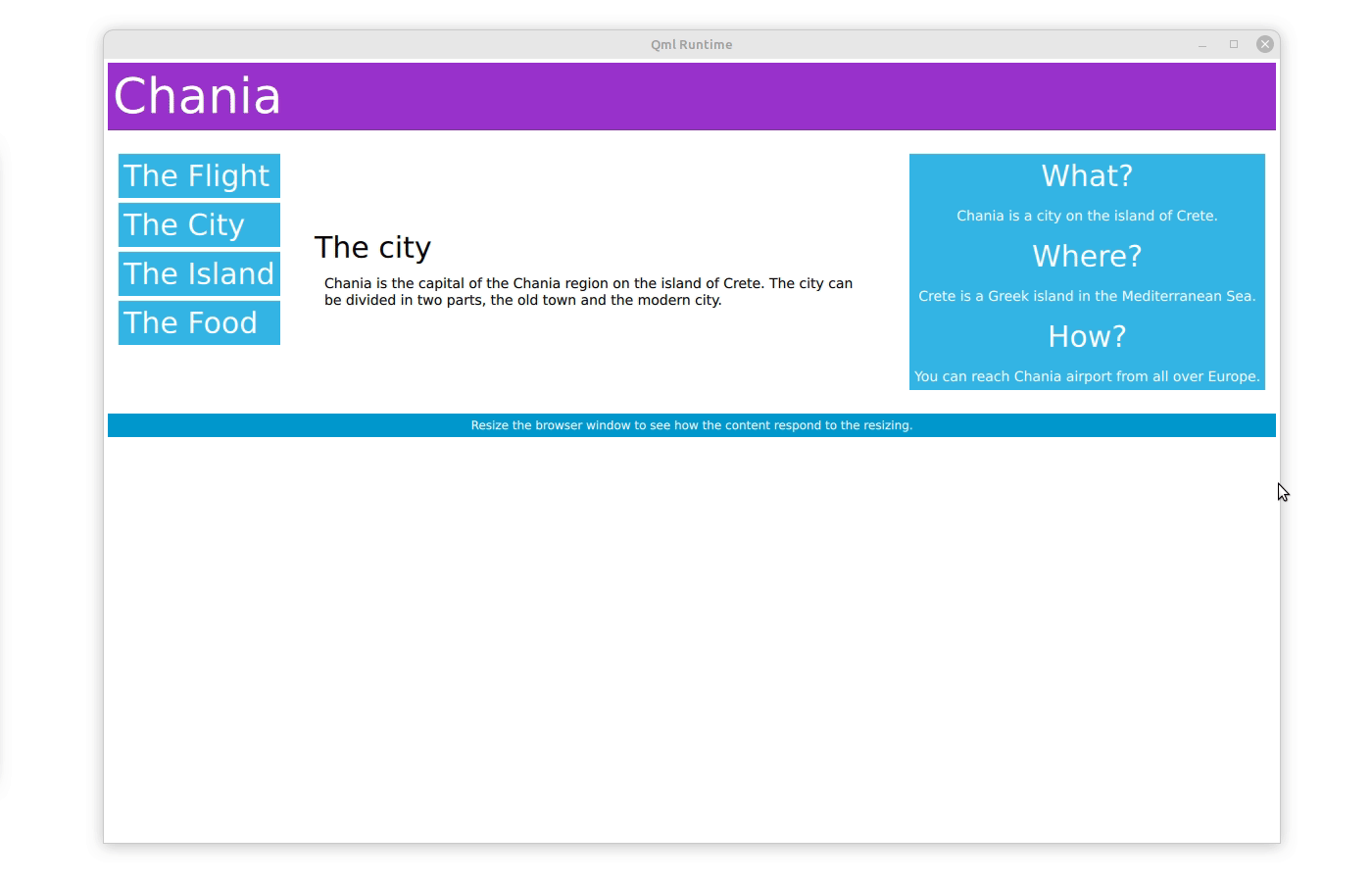
In the web world, responsive design is achieved by separating the actual content (expressed in the HTML language) and the layout (depicted in Cascading Style Sheets or CSS). Web developers program CSS to resize, hide, shrink, enlarge, or move the content to make it look good on any screen. To simplify, this means typically that a multiple-column layout on desktop displays is consolidated into a single column on mobile devices. With some tricks, similar behavior can also be implemented in Qt's UI framework, in particular with Qt Quick and the Qt Modeling Language (QML). A recent blog post describes how it can be done in the Qt 6.5 release. Adjusting UI content based on the available space is only one method to improve the customer experience while maintaining the integrity of the content (responsive UI layout maintains a particular hierarchy of the content without having to create dedicated web pages).
Why Accessibility Matters in UI Design
Tailoring UI content based on accessibility is crucial to include all users. The World Wide Web Consortium (W3C) has come a long way to create recommendations for making UI content available for people with disabilities. In the words of the W3C, “Accessibility involves a wide range of disabilities, including visual, auditory, physical, speech, cognitive, language, learning, and neurological disabilities. … These guidelines also make web content more usable by older individuals with changing abilities due to aging and often improve usability for users in general.” The Web Content Accessibility Guidelines are a collection of requirements on UI content. Implementing these requirements is often invisible to us users because they relate to the choices of UI designers and UI developers regarding the use of colors, contrast, video content, and hidden supporting text for people with visual disabilities. However, some websites include more visible executions of the accessibility guidelines, such as UI controls for contrast, font size, and layout shown in this web page on web accessibility which I found helpful in my previous job. Adjusting how we display UI content according to people's abilities is becoming more crucial as populations age. If you have ever changed the font size of your smartphone or the size of an Excel spreadsheet, then you know what I mean.
How to Implement Relevant UI Design: A Help Desk Example
While the above means to improve customer experience are tremendous or even crucial to be inclusive, there is another concept of UI design I call Relevant UI Design. Relevant UI design adjusts the layout of UI content based on user preferences. For example, In my previous job, we built a browser-based service/help desk software (also known as a ticketing tool). Very different people use help desk software. There are power users that work on IT issues from 9 to 5. But there are also HR specialist users who only occasionally use the service desk software to manage the HR team’s work. While the HR specialist prefers a clean and uncluttered UI with plenty of white space between different UI elements, power users couldn't cramp more content into a single display view. Power users were willing to sacrifice font size and white/line space between content to get maximum context at a glance.
Each user group was equally important in my previous job. How did we ensure that the UI design is relevant for each user group without creating many dedicated UI designs? By the way, we did take care of web content accessibility and responsive UI design at the same time. We solved this challenge by creating two UI layouts, essentially two CSS configurations: one with an immaculate UI design with plenty of white space (like you would expect from a modern web design) and another with minimized line spacing, margins, additional content, and font sizes. Users could switch their profile settings between these two UI layout modes making the UI design relevant to them. Power users loved the compact mode. HR specialists, managers, and novice users enjoyed the “clean” layout.
Combining Responsive, Accessible, and Relevant UI Design
In summary, when you design a user interface for an embedded device or a desktop application, you must adopt some form of responsive UI and apply at least a minimum of UI content accessibility guidelines. Keeping UIs relevant to all user groups without creating dedicated views allows you to maximize customer experience.
The Qt 6.6 release has more on responsive UI layouts in the Qt framework. Stay tuned!


