The Qt 6.7 feature freeze is today, and we now start the process of further stabilizing the code. The actual release is still a few months off, but I thought I would look ahead at bit at what improvements are in store for font handling in Qt and Qt Quick. More specifically there are three things discussed: Variable font support, a brand new "large font" text renderer and font shaping feature support.
Variable fonts
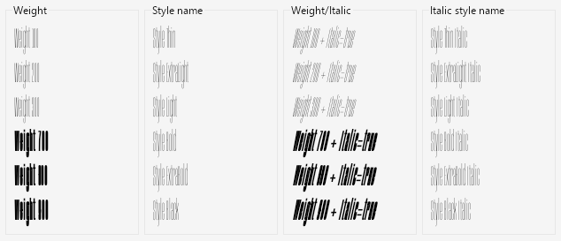
Back in the day, fonts came in a maximum of four variants (or so-called sub-families): Regular, Bold, Italic and Italic Bold. If you wanted any variations on top of this, you would have to create a brand new family name for these, since there were no other ways to disambiguate the font selection than providing a font family + one of these four styles.
These days, there's more flexibility: Fonts can have an arbitrary "style name" (or "sub-family name"), and many fonts will have large sets of variations to choose from. The variations can be for weight or italics like before, but also for other properties such as character width - and that way, it's possible to create very specific sub-families such as for instance "Bahnschrift Semibold Semicondensed". (History note: Compatibility with the older font system is actually still visible on Windows, where the sub-family name is often baked into a "legacy" family name for backwards compatibility, and you have a secondary set of "typographic" names which give you the real family and sub-family of the font.)
Logically, sub-families all belong to a common font family, but from a file system perspective they have been implemented as stand-alone font files. (In some cases, you can have a so-called "TrueType collection" file that contains a set of multiple fonts, but this is actually just a wrapper for easier distribution and it contains complete copies of each individual font file inside.)
In recent years, a new approach to sub-families has emerged: Variable fonts have floating point parameters called "axes" which alter how the glyphs of the font appear. The font designer provides a set of "masters" for each axis which identify how each glyph looks at the minimum and maximum values (and possibly others). Then they may define "named instances" for specific combinations of different values along the axes and the font system can interpolate between the masters to provide the exact requested appearance.
For instance, a font may support the standard 'wdth' and 'wght' axes for modifying the width and weight of the glyphs with four masters: wdth=50, wght=100, wdth=200 and wght=900. Once this is in place, the font designer can just define an instance called "Semibold Semicondensed" where 'wdth' is set to 87 and 'wght' is set to 600 and the interpolation will do the rest - no need to manually design each glyph for that particular combination of width and weight.
In previous Qt versions, loading such fonts as applications fonts was not supported at all, and you would get very poor results if you tried. Take, for instance, this screenshot of the variable Anybody font loaded in a Qt 6.6 application. The variable axes in the font are stuck at their minimum values and bold/italic is synthesized by the rasterizer in the cases where it's explicitly requested. Luckily, most variable fonts are still distributed with a backwards-compatible set of "static" font files, which has so far been the only way to load them in Qt.
In Qt 6.7, we are adding support for loading variable application fonts on all platforms. The QFontDatabase will look up the named instances stored in the font and add these as selectable sub-families. They can be selected using either the style name property or by weight/style, same as with traditional sub-families stored as separate files.
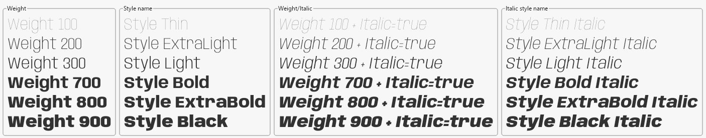
When selecting fonts using the traditional properties such as weight and width, the predefined named instances will be preferred, and Qt will try to find the closest match. In some advanced use cases, however, you may want more direct access to the variables axes to get the exact look you want.
Qt provides support for this through new APIs: QFont::setVariableAxis() and font.variableAxes.
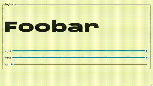
While many fonts will only support standardized axes such as 'wght', 'wdth' and 'ital', font designers are not limited to these. Any tags of four latin-1 characters may be used to specify an axis and can alter the appearance of glyphs in dramatic ways, as long as the number of contours and control points remain the same in all masters. (By convention, custom axes will be in uppercase to ensure there is no conflict with official axes that are introduced in the future.)
Take, for instance, the Anicons font which supports the custom "TIME" axis. Changing the TIME will cause glyphs to animate between key frames defined as "masters" in the font.
Note: As mentioned, this feature is available on all platforms, but on Windows it requires that you run your application with either the DirectWrite backend or the cross-platform Freetype backend. This can be done by passing e.g. -platform windows:fontengine=directwrite as command-line arguments to the application. Or it can alternatively be customized in the application's qt.conf. The DirectWrite backend is planned to take over as the default on Windows in the future, but for now it is opt-in. This is because it currently does not support legacy font names or bitmap fonts, so it will return a slightly smaller set of fonts than with the default GDI backend.
Curve renderer for text
The default way of rendering text in Qt Quick (since version 2.0) is something we simply chose to call QtRendering. This was mainly because we did not want to lock ourselves to a specific implementation for the default, so we picked a more general name. Under the hood, it's using an approach which is well-established these days: two-dimensional distance fields stored in textures to represent the contours of glyphs, and a fragment shader which can render these efficiently at a range of different sizes and scales with the same source texture.
This has turned out to be a very good compromise between performance and quality, and it is unlikely that the default approach will change at this point. However, there are some cases where the limitations of the algorithm are visible to the user.
Primarily, the problems arise when the font becomes too big for the source texture. The algorithm is no longer able to faithfully re-create the glyphs at the target size, and you will see artifacts, especially on sharp corners or thin features.
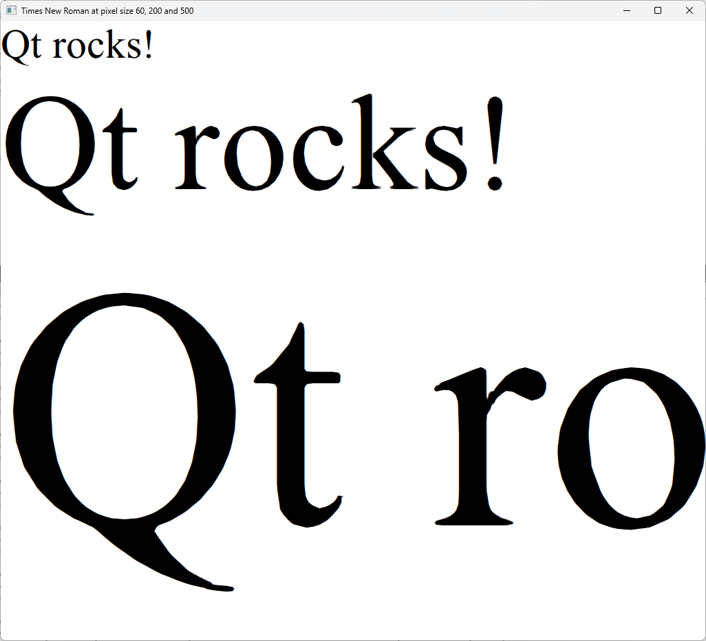
As is evident from this screen shot, there are artifacts visible at pixel size 200 which may or may not be acceptable, depending on your use case. At pixel size 500 the artifacts are warping the text and for most use cases you will be looking for work arounds if you need to use the font at that size.
Luckily we do already have solutions for this in place: Prior to Qt 6.7, the main ways to mitigate have been to either increase the renderTypeQuality (which will cause memory consumption to increase for the font in question) or to use the Text.NativeRendering render type (which requires pre-rasterization of the glyphs at the target size, so it will come at both a CPU time cost as well as memory cost.)
In Qt 6.6 we introduced a new renderer for Qt Quick Shapes that we called the Curve Renderer, and in Qt 6.7 this is now included as an optional text renderer as well, and it should be a perfect fit for rendering large text.
It does have a higher GPU time cost than QtRendering, so it isn't going to replace the default any time soon, but for larger text it will give you beautiful results even at very large scales, without eating up too much of your graphics memory.
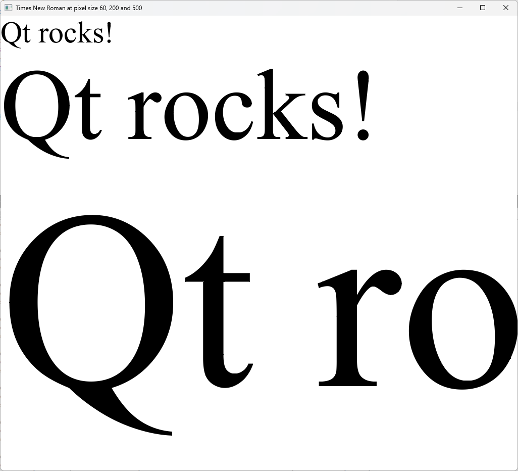
To try this out, set the renderType property to Text.CurveRenderer and run against Qt 6.7. For most application text the difference should not be very visible, but for large banners or headlines, it may give substantial improvements.
Font shaping features
Finally, a new API for the advanced users: For context, "text shaping" is what we call the process of taking a sequence of Unicode characters and a font and then converting this into a set of glyphs and their positions relative to each other. This covers both grammatically necessary processing, such as combining certain sequences of characters into ligatures in e.g. Arabic or Indic languages, and it also covers more cosmetic features such as kerning.
While the default behavior of the font shaper in Qt is most commonly what you want and expect, in some situations it is convenient to be able to directly influence this process. To enable this for users, we are now exposing such font shaping features through Qt's font APIs: QFont::setFeature() in C++ and font.features in QML.
The font features are similar to variable axes in that they associate a value with a four-character "tag". For features, however, the value is an integer and is in practice usually either 0 or 1 - off or on. Enabling or disabling a given feature decides whether it will be included when deciding which glyph will be selected and what its relative position will be.
OpenType® provides a list of registered features. Like with variable axes, a font can include features with any valid tag, and by convention upper-case tags are used for custom features.
Certain features will be enabled by default in Qt, depending on what other font properties are set. The API grants you access to overriding whatever Qt would otherwise default to, and force the behavior you need. Any feature you leave unset in the QFont will keep its default value.
For instance, Qt will enable the use of optional ligatures by default unless a custom letter spacing is set. For some fonts, this means certain typical combination of characters will be shown as a single, merged glyphs, which may be more visually pleasing than the individual letters next to each other. A common example is 'fi', and 'ffi' which in many fonts have corresponding ligatures. For instance, here's the Calibri font from Windows:
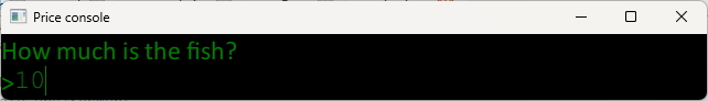
When this font is used and the ligature feature is on (as it is by default), any immediate sequence of 'f' and 'i' will be replaced by a single, combined glyph which visually binds the text together.
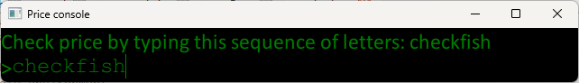
However, there are some cases where the letters are logically separate and should not be combined in this way. One example could be in the documentation of keyboard shortcuts:
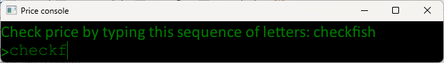
Merging the characters makes it slightly less clear that these are individual key strokes. To make sure the this does not accidentally happen, we can set the 'liga' feature to 0, thus disabling the feature in the shaping process.
There are many more of these smaller adjustments that can be made by enabling/disabling font features. In addition, certain fonts contain different stylistic alternatives of glyphs which can be selected using e.g. the 'salt' feature.
Conclusion
As mentioned at the start, this is all upcoming in the next release of Qt. Font features are already available through a tech preview API in Qt 6.6, but please take note that the C++ API is due to change in Qt 6.7 based on feedback, so any code using it will have to be updated for the new API.
For the adventurous among us, everything discussed here can be tested already by fetching the dev branch of Qt at code.qt.io and building it manually. But as always when using the development branch of any open source project, be prepared that errors may occur, as this branch is being updated continuously through the day (if you do find bugs, we would of course love to hear about them so we can make sure they are fixed before we release.)
Final note: Qt 6.7 is still under development, so it is still possible that new APIs and features may change, as a result of our many-phased review process. So make sure to check the snapshot documentation if you encounter problems after upgrading to a new snapshot.