As accessibility continues to gain traction across major operating systems, high contrast mode has become a key feature for improving visual clarity and usability. With the release of Qt 6.10, applications built with Qt now readily get support for high contrast mode across multiple platforms, ensuring more inclusive and visually adaptive UIs. In this post, I explore how Qt 6.10 supports high contrast mode, what it means across different systems, and what Qt now provides for built-in styles.
Check out this quick video on a high contrast mode example to get you started:
Enhancing Accessibility with Better Contrast
In recent years, major platforms such as Windows 11, macOS, and the Gnome desktop have introduced settings for a high contrast mode that enhances the contrast between foreground and background user interface elements. Adjusting these contrast settings typically updates the system color scheme and, in some cases, adds more pronounced outlines or other modifications to native UI controls. On macOS, iOS, and Gnome, users can enable increased contrast through a toggle in the accessibility section of the system settings, which reinforces outlines for most native controls. Windows 11 takes a more advanced approach with its Contrast themes feature, resulting in significant changes to the appearance of native applications when activated.
New with the High Contrast Mode in Qt 6.10
One of the new shiny features we're bringing to 6.10 is the ability to detect if the system is running in high contrast mode.
Since high contrast mode isn't a standardized concept that all platforms share, our definition is that high contrast mode is enabled if any of the following conditions are true:
-
On Apple platforms, the Increase contrast setting is enabled.
-
On Windows 11, a Contrast theme is applied.
-
On the Gnome desktop, the High Contrast setting is enabled.
-
On WebAssembly, the CSS 'prefers-contrast' media query doesn't resolve to 'no-preference'.
In addition to detecting this from the system, we have enhanced several of our own built-in styles to better align with users’ contrast preferences.
In 6.10 these are the Windows 11, macOS, and Fusion styles for Qt Widgets, and Basic, Fusion, macOS and FluentWinUI3 for Qt Quick Controls.
High Contrast mode for Qt Quick Controls
Basic
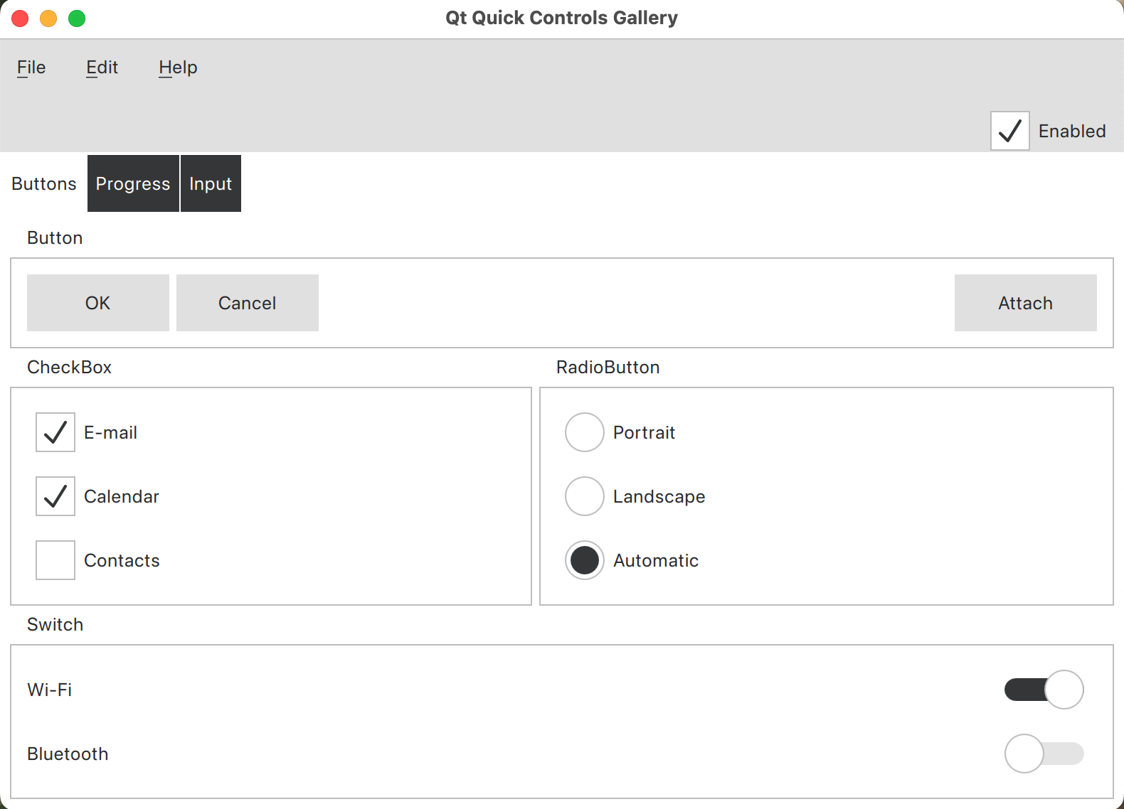
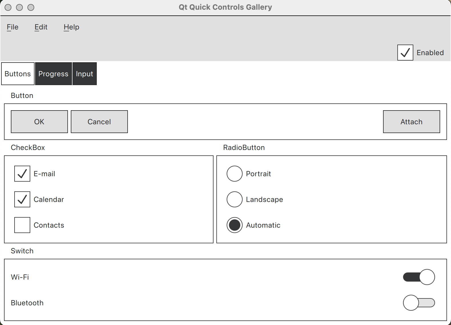
The Basic style now provides a built-in palette for both light and dark color schemes, and most controls will now have stronger outlines when high contrast is enabled. The images below illustrate a simple application: the left image displays the application in standard contrast mode, while the right image demonstrates its appearance in high contrast mode.
Fusion
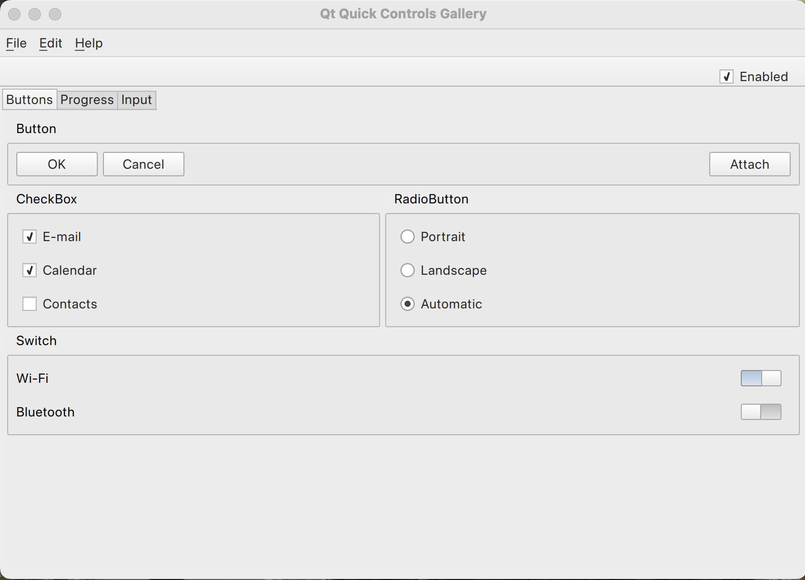
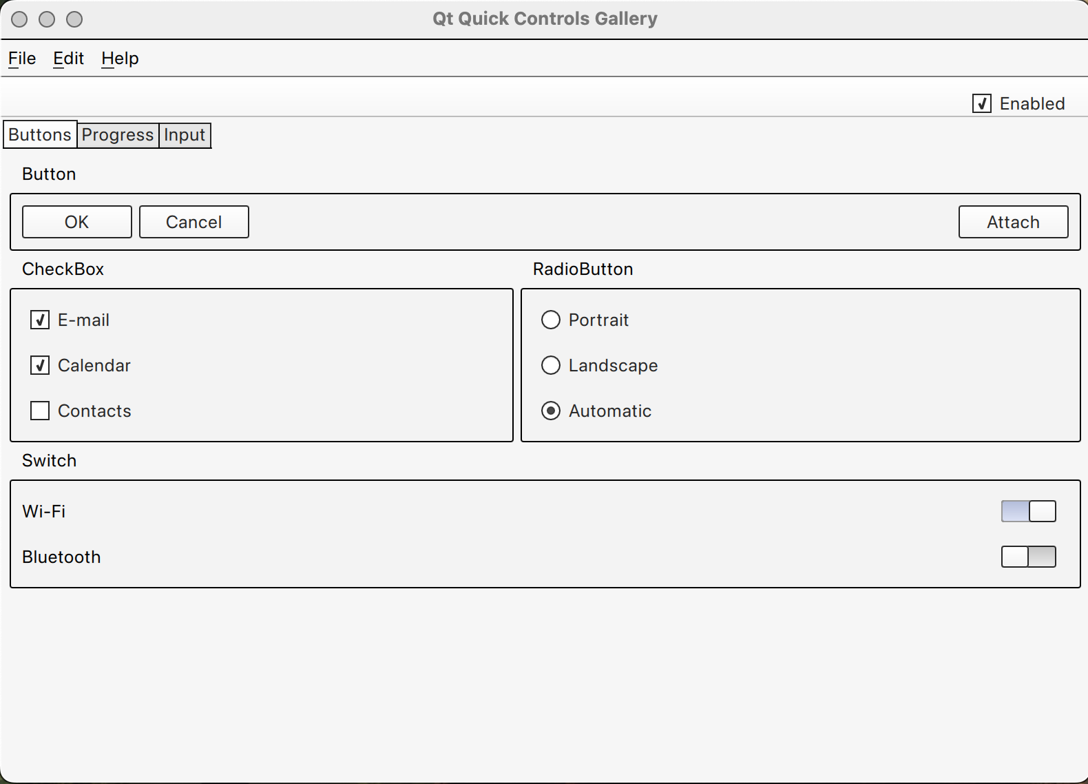
Similar to the Fusion style in Qt Widgets, we're also adding stronger outlines to most controls in the Fusion style when high contrast is enabled. The screenshots below present the same application, with the image on the left depicting standard contrast mode and the image on the right showing how it looks in high contrast mode.
FluentWinUI3
The FluentWinUI3 style is designed to adopt the same look and feel that native WinUI 3 windows apps have. Significant improvements have been made to the style in 6.10 for users of the contrast themes feature. Most controls should look very similar to native ones, independent of system theme and appearance.

High Contrast mode for Qt Widgets
macOS style
Since the macOS style uses native APIs to render controls, it already supported the Increase contrast mode, found in System Settings -> Accessibility -> Display -> Increase contrast.

Windows 11 style
While Qt Widgets provide multiple different windows styles, the most relevant today is the Windows 11 style.
Normally the Windows 11 style will use hard coded colors from the official Microsoft Figma template, but when a contrast theme is applied, we want to read color information from GetSysColor instead. We're continuously improving this style, in order for it to use the expected colors. Here is a preview of what the style currently looks like when using the various contrast themes.

Fusion style
The Fusion style will now give stronger outlines to controls when high contrast is enabled.

Making Accessibility Easy
We’re adding the support for high contrast mode in Qt 6.10 to make it once again easier for you to create accessible and inclusive UIs. By aligning with platform-specific contrast settings and built-in styles like the mentioned Windows 11, macOS, Fusion, and FluentWinUI3, your applications are not only more accessible to a wider user base but also visually consistent. In addition, you’ll have it easier to comply with various accessibility regulations.