May 19, 2026
Why UI Developers Need Sometimes Design Support - and How the Skill Provides It
Not every UI developer has a UX designer at their disposal. Some R&D teams, especially in small and medium-sized businesses, need to build a user interface without the help of human UI design experts.
And while today’s frontier Large Language Models are remarkably capable at generating Qt Quick and QML code, they tend to produce interfaces that are suboptimal from a UI design perspective, especially for embedded devices. Human design expertise is always preferrable over the application of basic design principles, but sometimes human expertise is just not available, for a reason or another. As a part of Qt's AI-powered development tools, the Qt GUI Design skill closes that gap by giving the agent a thorough, principled design knowledge before any code is being written.
The skill instructs AI agents to consider UX design principles before doing any UI development work. It defines a systematic intake process, encodes a library of well-understood UX laws, provides platform-specific constraint tables for desktop and embedded targets, includes an accessibility checklist, and describes how to perform a structured design audit. When an agent follows this skill, the resulting QML is not just functional - it reflects deliberate decisions about hierarchy, touch targets, typography, motion, localization, and error handling.
Video: UI design review of image using GitHub Copilot in VS Code (some sequences are shortened, de-/accelerated)
Why AI Agents Need Explicit UX Knowledge to Design Well
Large Language Models have read more design documentation than most human designers will ever encounter, yet without a structured prompt they apply that knowledge inconsistently. An agent asked to "build a fitness machine control panel" will make dozens of implicit choices - how many metrics to show at once, what size the touch targets should be, whether to use color alone to distinguish states, how to handle a 480 × 272 embedded display versus a 1920 × 1080 desktop monitor. None of these decisions are random, but without guidance they are driven by statistical pattern-matching on training data rather than by considered application of UX principles.
The Qt GUI Design skill makes these decisions explicit and reviewable. When the agent has a skill file, its design choices can be traced back to named principles - Hick's Law drove the reduction in simultaneous options, Miller's Law determined the grouping strategy, the 48 px touch target minimum came from the embedded constraint table, the color-plus-icon approach came from the WCAG accessibility rules. The difference this makes in practice is visible.
Side-By-Side Comparison: UI Implementation with and without Skill
Let’s look at the UI implementation of a gym stepper machine implemented as interactive prototypes, once without the skill and once with the skill. Both interactive prototypes below were generated from the same design brief: a gym stepper machine control panel with workout metrics, program selection, incline control, and a timer. The input prompt was identical. The only variable was whether the agent had the Qt GUI Design skill loaded.
Gym Stepper Console Created without Skill
UI generated with a generic "build a gym stepper machine UI" prompt. The AI agent made all layout, colour, and hierarchy decisions based on pre-training knowledge of the LLM.
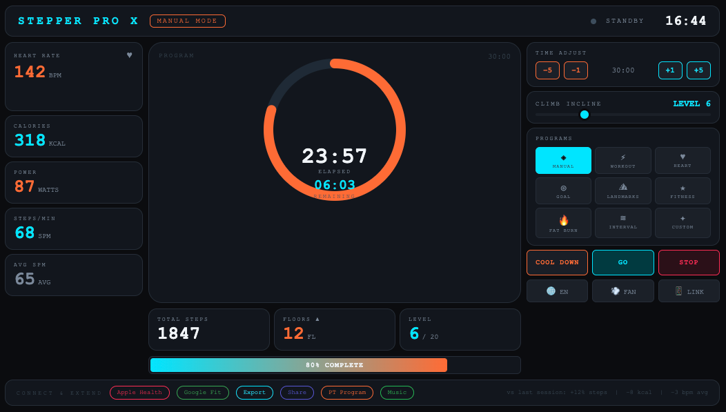
Issues:
-
Visual noise overload: A monospace font and neon-on-dark color palette borrow from developer terminal aesthetics. Gym users expect clarity at a glance, not a command prompt. Four distinct accent colors compete for attention simultaneously, violating the von Restorff Effect - if everything is highlighted, nothing is.
-
Colour as sole state carrier: The heart rate metric changes colour only (green → amber → red) with no supporting icon or text label. Colour-blind users, and users glancing at the screen from an angle, cannot reliably distinguish states. This violates WCAG 1.4.1 and the skill's semantic colour rules.
-
Touch targets below minimum: The program selection buttons in the right panel are approximately 38 × 30 px - well below the 48 px embedded minimum defined in the skill. On a touch screen while exercising, mis-taps are highly likely.
-
Information architecture: The central donut clock is visually dominant, but the most actionable data - current heart rate and power output - is buried in the left column at the same visual weight as secondary statistics. The Inverted Pyramid principle is not applied; critical data does not lead.
With the Qt GUI Design Skill
The same brief, but the agent was given the Qt GUI Design Skill first. It ran the intake questionnaire, established a clear content hierarchy, applied the embedded constraint table, and used semantic colour with supporting text labels throughout.
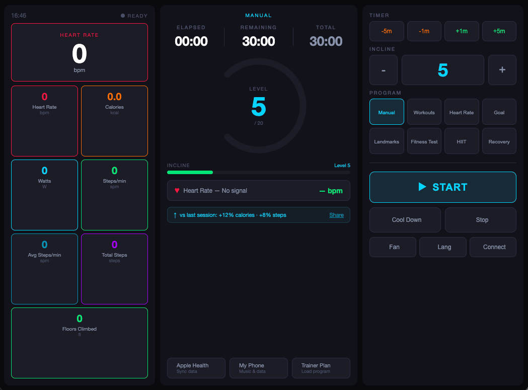
Improvements:
-
Clear primary metric hero: The agent applied the Inverted Pyramid: the most important metric (heart rate) anchors the left panel as a hero card at 52 px. Secondary metrics are uniform tiles below it. Clicking any tile promotes it to hero - a Progressive Disclosure pattern that keeps the screen readable without losing access to detail.
-
Colour + text state labelling: Every state change pairs colour with a text label: the heart rate badge shows both a colour and a zone name ("Zone 3 - Aerobic"). The GO button changes colour, icon, and text label simultaneously when transitioning between START → PAUSE → RESUME → COOL DOWN states.
-
Touch targets at 48 px minimum: The incline − / + buttons are 56 × 60 px. Timer adjustment buttons are 40 px tall. The main GO button is 62 px - large enough to hit confidently mid-workout. All targets meet the embedded minimum from section 4.3 of the skill.
-
Semantic, consistent typography: The design uses a two-family type system: 10 px spaced all-caps labels for metadata, 20–52 px bold for metric values. The scale follows a modular ratio (roughly 1.4×) and uses no more than three active sizes per zone, consistent with Miller's Law chunking.
What the Qt GUI Design Skill Does for UI Developers
The skill is triggered whenever the user asks the AI agent to create, review, or audit Qt, QML, or other embedded device UIs, applications, or projects. Due to the nature of agentic harnesses planning their own work, the best way to ensure that the intake questionnaire is presented, it is recommended to use the /qt-gui-design command as opener of the prompt.
How the Skill Applies UI Design Principles for Desktop and Embedded Device Applications
The skill is structured into the following six steps:
-
Intake questionnaire: The skill instructs the agent to ask seven mandatory questions before touching a layout: target platform, screen shape, resolution and DPI, whether a design system exists in Figma, content priority ranking, viewing distance, and locale/input requirements. The agent may not skip this step. Collecting these answers before writing code prevents the most common category of design error - optimizing for the wrong display or the wrong user.
-
General design principles application: The first step is to read 18 named design laws (Hick's Law, Miller's Law, the von Restorff Effect, the Peak-End Rule, the Doherty Threshold, and others). These are applied silently while designing - the agent does not narrate each decision, but each decision must be traceable to a named principle. This makes design reviews meaningful: you can ask "why is the layout structured this way?" and receive a specific answer.
-
Embedded device UI principles application (only when relevant): This step decides whether to apply desktop application design UI guidelines or design the UI for embedded devices. It defines rendering constraints (no gradients, no blur on non-GPU hardware), a fixed-pixel layout requirement, touch target minimums per use environment (48 px standard, 60–72 px for gloved-hand industrial contexts), bitmap font sizing tables by viewing distance, and a safety-critical error state protocol requiring three independent cues - colour, shape, and text — for every alarm condition.
-
Accessibility principles application: This steps instructs the agent to map the UI to WCAG 2.1 standards and requires the agent to verify contrast ratios, keyboard navigability, focus ring visibility, and colour-independence of all state changes. These requirements apply regardless of the target platform (desktop/embedded).
-
AI usability principles application: This step handles a category of guidelines most design systems ignore: screens where the AI itself is a visible actor. It requires streaming output indicators, skeleton screens for long-running operations, explicit consent before AI reads user data, and uncertainty communication for probabilistic outputs.
-
UI design audit (optional to review tasks): When reviewing existing designs rather than creating new ones, the agent skips directly to this workflow step and categorizes every finding as Critical, Warning, or Opportunity - matching the severity model used in Qt's own tooling.
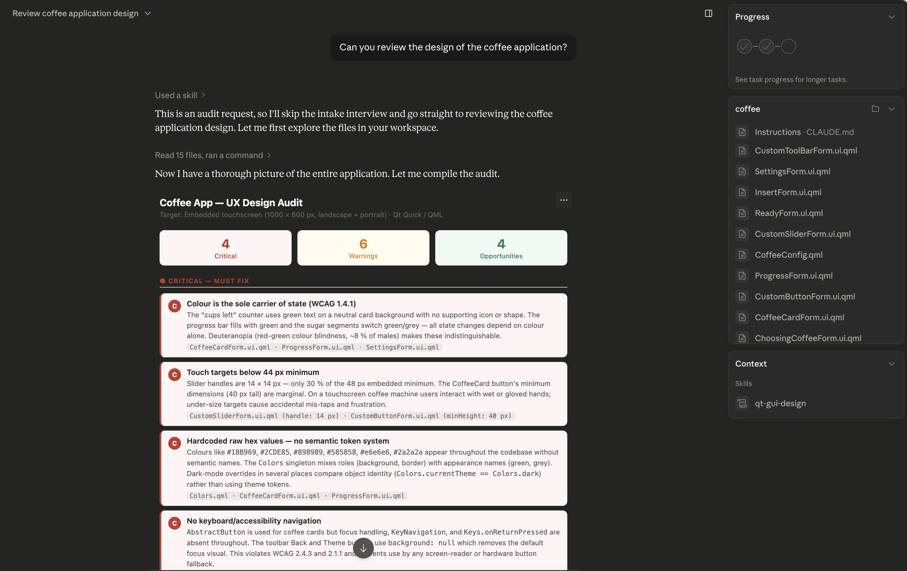
Image: Screen capture of UI design review of Qt's coffee machine example application in Claude Desktop
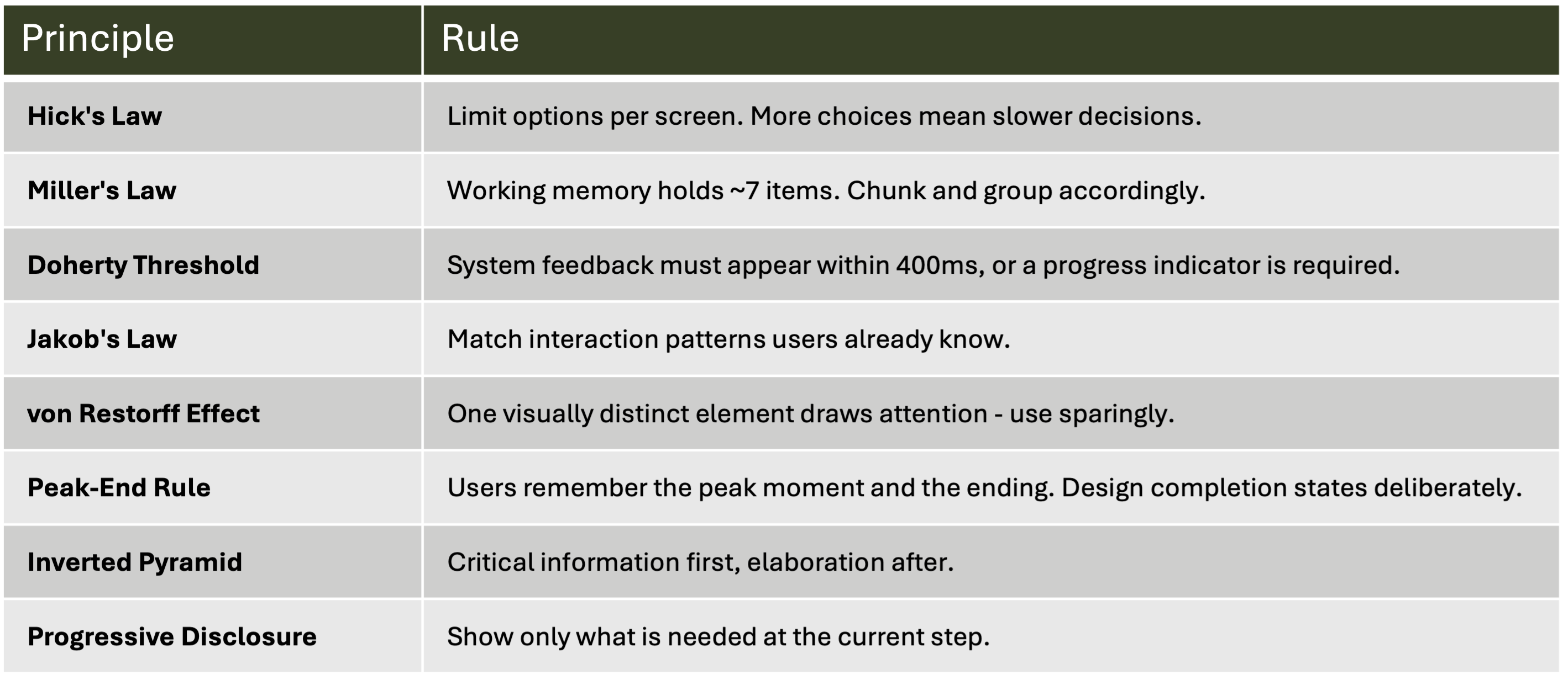
General UI Design Principles
Below is a subset of the UX laws the skill carries. These are not decorative references - each one is attached to a concrete instruction the agent must follow.
Embedded Device UI Design Principles
The knowledge of embedded device constraints and their effect on UI design is crucial for successful UI implementation by AI agents. Desktop-centric design assumptions - fluid grids, gradient fills, drop shadows, hover states, tooltip-triggered disclosure - fail silently on hardware without a GPU. The skill replaces those assumptions with a fixed-pixel mental model.
When the agent detects or is told that the design target is an embedded device, it applies the embedded device UI recommendations before doing anything else.
Qt GUI Design Skill vs. Designer Tools: What's the Difference?
The Qt GUI Design skill targets UI developers, not UI/UX designers. UI/UX Designer tools, such as Figma to Qt and Qt Design Studio, help UI/UX designers to create beautiful experiences.
Figma to Qt is a Figma plugin that allows UI/UX designers to craft GUI designs in Figma, preview them, check for issues, fix these early, and convert the validated design into working QML code that developers can open and work on in Qt Creator, Visual Studio Code, or Qt Design Studio.
Qt Design Studio is a standalone UI design tool that UI/UX designers can use when Figma is not enough, for example, when they need to include 3D elements in their graphical user interface or build advanced animations and transitions.
Figma to Qt and Qt Design Studio are for larger teams and complex projects. Since Qt is committed to letting professionals use their preferred tools and workflows when building experiences on embedded devices, we are now releasing Qt GUI Design Skill to help UI developers in small and medium-sized businesses without design support.
Note that developers using Qt Creator 20 can benefit from the Qt GUI Design Skill through the AI agent extension for Claude, Codex, or other agentic harnesses.
How to get the Qt GUI Design Skill
The skill it part of the Qt agent skills plugin. The plugin can be downloaded from Qt’s GitHub repository or can be installed from the Claude Marketplace plugin qt-development.
The agent skills plugin also includes the qt-qml coding skill, which covers QML-specific implementation patterns. When both skills are active, the agent runs the design intake first, then generates QML that reflects those decisions.
Bonus Reading: Use Cases for Qt GUI Design Skill in Your UI Development Workflow
The skill fits naturally into several different starting points. Whether you are beginning with nothing more than a verbal description of a problem or a sketch, the skill adapts to your workflow rather than demanding a fixed entry point.
1. Input: Specification-only – Output: UI Design
No visual design tools are involved: A product owner or developer describes the screen in words: "Create an installer welcome screen for a Qt application, targeting Windows desktop, with a language selector and a Next button." Without the skill, the agent will produce one plausible layout and stop, having made all structural decisions silently.
-
The agent runs the intake first to establish hierarchy (what is the primary action?), locale requirements (does RTL support matter?), and typography baseline.
-
It can then generate two or three structurally distinct proposals - one that foregrounds the language selector using Progressive Disclosure, one that uses a Z-shaped reading pattern to drive the eye toward the CTA, one that applies a modular scale optimized for an information-dense installer flow.
-
Because each proposal is grounded in named principles, merging the best elements from each is a deliberate act rather than a guess: "take the CTA treatment from option 2 and the language control placement from option 3" produces a coherent result because both decisions have the same principled foundation.
Key benefit: Multiple solutions can be intelligently merged rather than arbitrarily combined.
2. Input: Wireframe → Output: UI Design Implementation
A developer or designer sketches rough wireframes - either in a drawing tool or on paper - and uploads them as a structural starting point. The wireframe establishes zone placement and rough content regions but carries no design decisions about color, type scale, spacing, or interaction model. Without the skill, the agent fills those gaps however it sees fit, often producing something that looks finished but has unmeasured touch targets and arbitrary hierarchy.
-
The wireframe becomes the layout skeleton, and the skill supplies the design flesh
-
The agent reads the wireframe zones, then applies Proximity and Similarity to confirm groupings, checks that every interactive zone meets the platform touch target minimum, derives the type scale from the viewing distance specified in the intake, and assigns semantic color roles rather than decorative ones.
-
The wireframe author's structural intent is preserved; the skill's principled constraints ensure the implementation meets measurable quality standards.
-
Teams that work in a lo-fi design language and move quickly to code find this path particularly productive.
Key benefit: Structural intent is preserved while measurable quality gaps are filled automatically.
3. Input: Existing UI implementation → Output: Structured UX Audit Report
A UI developer wants to improve an existing UI implementation and would like to get improvement suggestions. Without the skill, asking an agent to "review this design" produces a list of general impressions with no consistent severity model.
-
The AI agent switches to audit mode and applies a structured three-tier classification: Critical issues - WCAG violations, missing safety cues on embedded targets, touch targets below the hard minimum - must be fixed before shipping
-
Warnings flag elevated cognitive load, inconsistent affordances, or pattern mismatches that create user friction.
-
Opportunities identify enhancements such as a streaming output indicator for an AI-powered feature, or a completion state that applies the Peak-End Rule.
-
The audit can be applied to a Figma file, a screenshot, an existing QML component, or a running application.
-
The output is a prioritized action list that a development team can triage and assign directly.
Key benefit: Audit findings are prioritized, actionable, and traceable to named standards - not subjective opinions.


