Unique Graphical Elements
Patterns
Patterns also play an important role in visually developing the “Behind the scenes” idea. They are a versatile tool that can be used in front of, or behind imagery.
The brand guide comes with a selection of 3 premade patterns but new patterns can be constructed using the simple construction grid and guide.
The QA identity concept works around the idea of automatization, analysis and closing of “gaps in code” that happen behind the scene. This is visualized through a repetition of blocks creating a colorful pattern.
This pattern is layed over or under imagery to show the complexity of digital products and give a sense of seeing behind the scenes.

Pattern Grid Construction
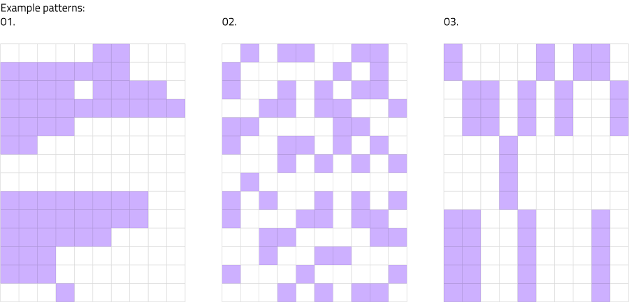
This brand guide does come with a selection of 3 premade patterns (01.,02.,03.) but new patterns can be constructed using the simple construction grid on the left and the description below.
- All QA pattern is constructed on a rectangular grid. Always use the grid as a base to construct it.
- Smallest unit of the pattern is a square.
- The squares can be arranged freely, loose or dense, in different rhythm, keeping the “square” look (02.) or opting for a longer “rectangular” one (03.). Independent of the look, take care to create a pattern that looks continuous and even at the scale it is used.
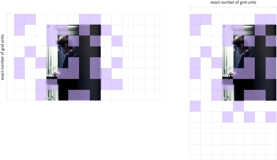
Alignment of Pattern and Imagery
When creating a layout with pattern and/or imagery, use a square grid. The grid not only helps you in creating a good layout, but also helps with aligning the pattern and the image.
Other Examples of Overlaying Patterns and Images
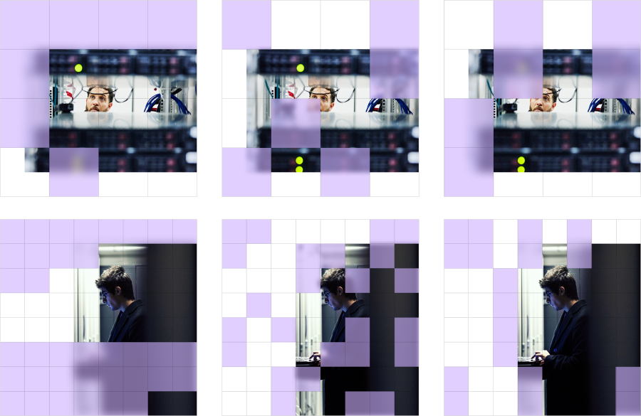
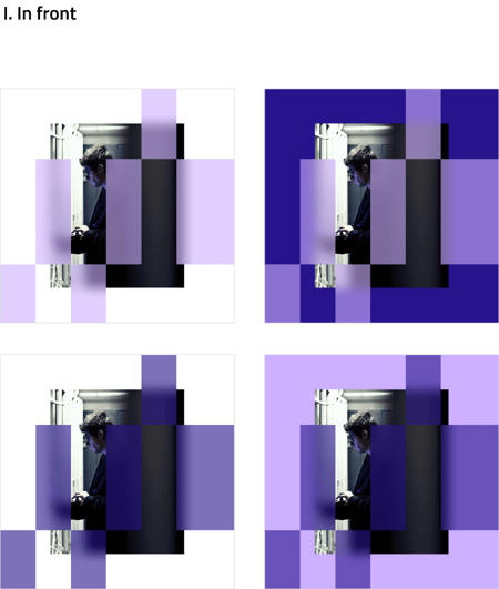
Pattern in Front
Patterns can be placed in front of imagery. In that case the pattern is set to 60% opacity and receives a background blur effect (20px, adjusted depending on the size of the pattern and image).

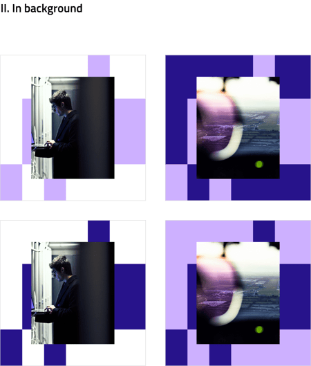
Pattern in Background
Patterns can be placed behind imagery. In that case the pattern is set to 100% opacity, solid color and receives no effect.

Coloring of Patterns
The following color combinations can be used when creating pattern layouts. Never use the QA patterns in any other color than the primary QA brand colors or their “glass” version.
Don't Do
Other rules of pattern usage:
- One is allowed to create a new pattern or modify the original 3 examples
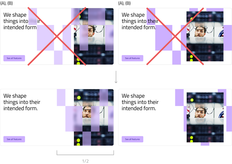
- Do not place patterns above or below text, logo or other graphical elements. (A)
- When combining pattern with text, logo or other graphical content, create a clean area with no pattern and place text or other graphical content onto that area. (B)
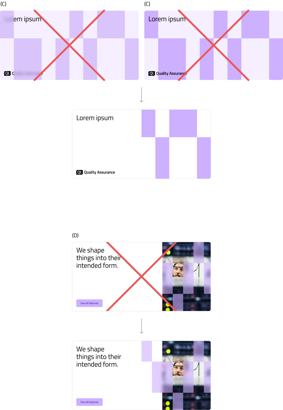
- Do not create color combinations with the pattern and background that are not allowed, for example Violet glass on Violet background, or Violet on a tint of Violet, etc. (C)
- When using pattern on top of imagery, do not use the image area to crop/mask the pattern, since it lessens the "behind the scenes concept". (D)