Brand Colors
The color palette of QA includes 8 distinctive colors that represent the whole Qt color system.
This section showcases all our colors with special focus on the primary QA brand colors. Here you can find all necessary color codes, basic guidelines for color usage and additional tint colors for UI design purposes.
The color swatches files for Photoshop, Illustrator and InDesign are available from the Download Assets link.
Primary QA Brand Colors
Copy-paste the HEX, RGB or CMYK values from the table below:
|
Violet #CDB0FF |
Midnight #27138B |
|
White #FFFFFF |
Black #000000 |
Use black as text color on white background to achieve the highest possible contrast, and the best readability.
Color Tints
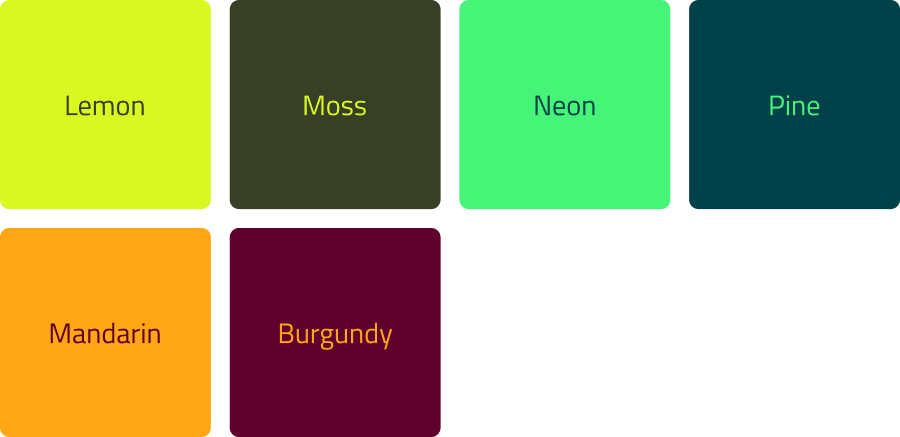
Additional QA Brand Colors
The color palette of QA includes 8 distinctive colors that represent the whole Qt color system.
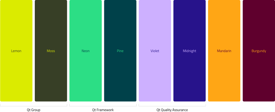
QA additional brand colors can be used in a supporting role, when the main brand colors and their tints are not sufficient:
- charts and graphs
- maps
- illustrations
The additional colors of QA brand should never overpower the primary colors. Always make sure that Violet and Midnight are the most dominant colors of any application. Only use the additional color palet when the primary colors are not sufficient.
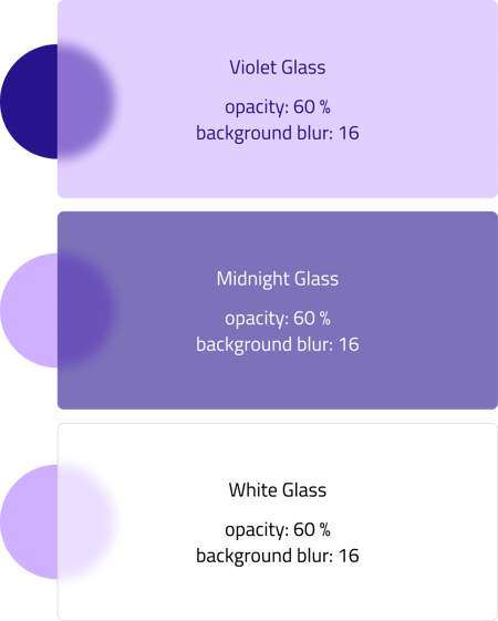
Glass Effect
The QA brand colors can be used with a half transparent glass effect. To recreate this fill style, set the objects opacity to 60 % then add a background blur effect to it. The amount of blur should be 16.
In addition to the background blur, add white inner shadow to the glass objects as shown on the following screenshots.
Color on Graphic Elements
In order to create a light and fresh look, use white in abundance as background color. Use Midnight and Violet with measure. Avoid using black as background color, especially in large sizes.
When combining the brand colors, avoid using low contrast combinations. (eg.: black on Midnight).
Colors and Typography
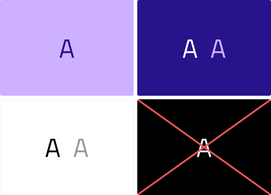
Readability is key when creating text layouts. To achieve that, always aim to place all text blocks on white, or solid brand color backgrounds.
On top of white backgrounds, use black or dark grey as text color. Use Midnight as text color on Violet backgrounds. Use Midnight as text color on Violet backgrounds. Always avoid using black as background.
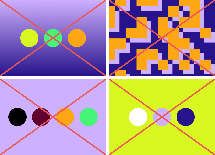
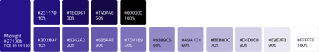
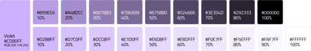
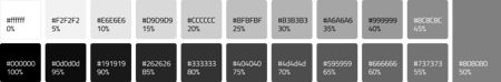
Don't Do
The QA brand uses flat, solid color blocks and the predefined “glass” effects. Avoid using any other fill styles (gradients or complicated graphical patterns).
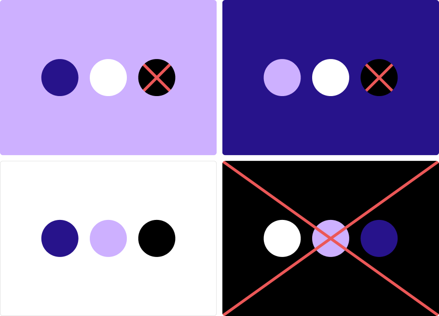
Additional colors taken from the Qt color system can be used on QA brand materials as standalone objects on a white background. Placing any of the additional colors on top of Violet or Midnight backgrounds, should be avoided.
Don’t use any of the secondary colors as background.