Iconography
QA has two different levels of iconography. Detailed, illustrative icons are used when the content needs more visualization and images are not relevant. A set of more minimalistic icons are designed for QA products. They are mainly used in very small sizes across product communication materials.
This section shows the basic design principles for creating new icons and expanding the set if needed.
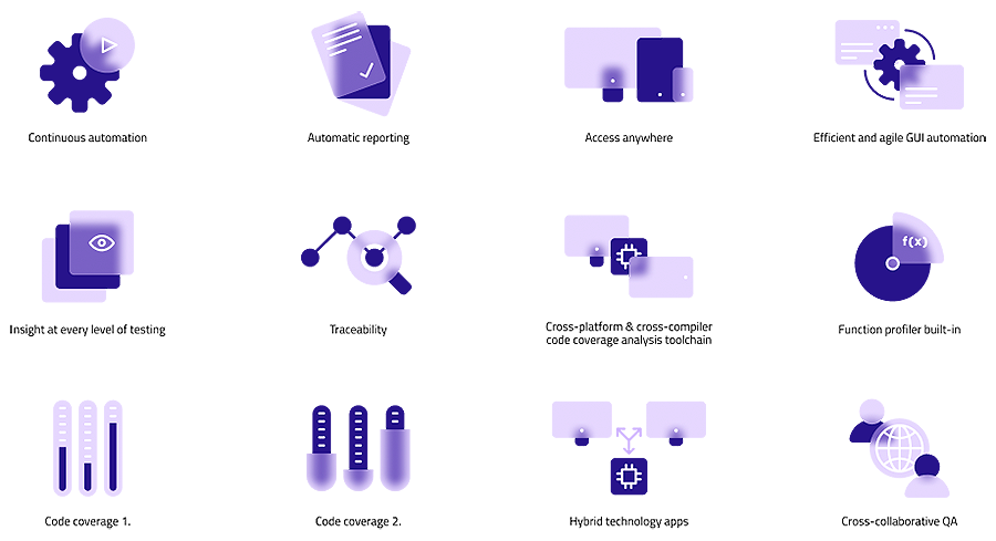
Feature-Benefit Icons
Due to their level of complexity, these illustrative icons should be used in larger sizes (minimum width of 112 px pixels). When possible, place the icons on white background. An alternative set of icons is available for using them on Violet backgrounds.
Minimum Safe Space
The recommended amount of safe space around illustrative icons is 20% of its width (rounded up or down to the closest whole number if needed).
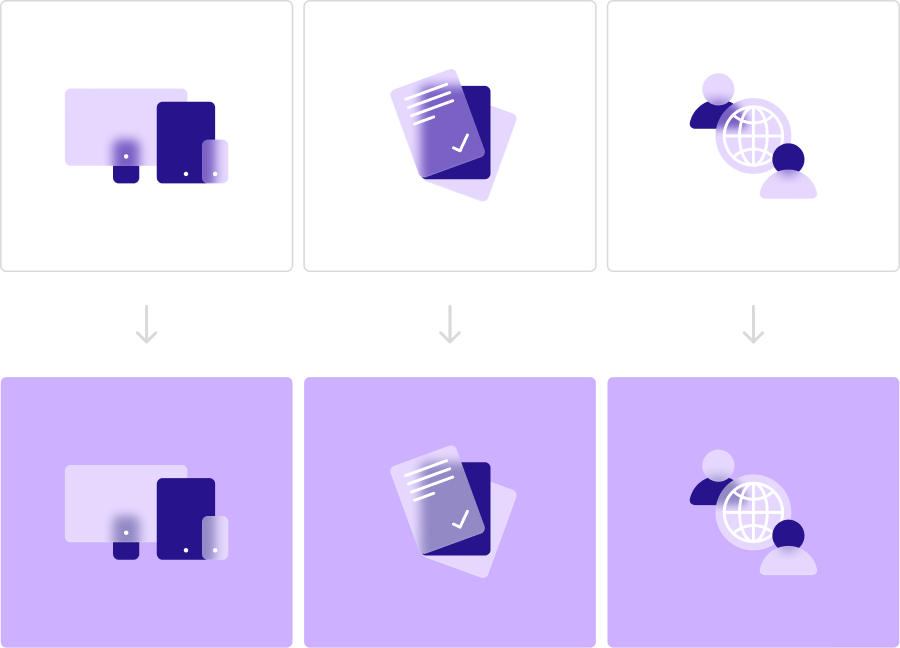
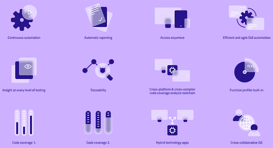
Alternative Colors
The illustrative icons have an alternative color style that makes it possible to place them on Violet backgrounds. The alternative color way of the icons is created by changing Violet glass to White glass fill style.
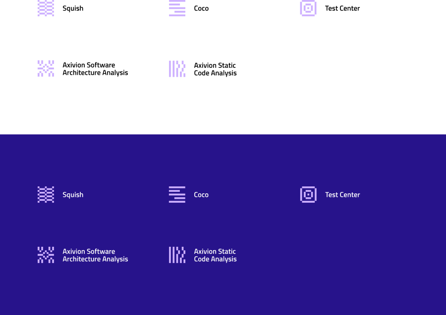
Product Icons
Products are visualized with minimalistic icons which are mainly used in very small size. (approx. 32 px).