Typography
The Qt Qt Group brand uses the corporate typeface of the Qt brand system, Titillium Web. Titillium Web is an open-source, free typeface available from the Google Fonts font library. The brand uses the fonts in Light, Regular, Semibold and Bold cuts.
Download all needed font files from here.
Corporate Typeface

Type Hierarchy
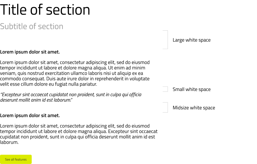
When creating type layouts, always set all headings, titles or paragraphs in “sentence case”.
Create a hierarchical division between the different parts of text layouts by using 2-3 text sizes, and weights.
- Feel free to use large font sizes for titles. (48-200 pt)
- Subtitles can be midsize. (24-48 pt)
- Use small-size fonts for body text. (14-24 pt)
White spaces (paragraph/line spacing) are also important elements of typographic compositions. Make sure that the spaces between different blocks of text are consistent. Use larger white space to separate paragraphs, and smaller gaps to create belonging between them.
Non-Western Fonts
When creating documents that use Chinese, Japanese or Korean characters, please use the following fonts:
- Chinese - Source Han Sans
- Japanese - Yu Gothic
- Korean - Malgun Gothic
These fonts are available for download from the Qt Group fonts download link.