Published On
Read Time
15 mins
When Creative Navy redesigned the interface of vehicle calibration equipment, the display was not read from a chair at a desk. Technicians read the embedded display from 2–3 m while moving around the vehicle, often in gloves, under variable workshop light and around reflective surfaces. The calibration sequence did not pause while they read it.
That distinction matters because the interface was embedded in the work rather than separated from it. The person reading it was already doing something else, at a physical distance from the display, while the equipment continued its sequence. The useful question was therefore not whether the screen looked clear in isolation, but whether it remained clear while the work continued.
The earlier interface was not badly engineered. Engineers who understood the machinery had refined it over three iterations, and its workflows were reliable. On a desk it was legible. In the workshop, however, measurement values, tolerances and progress indicators carried equal visual weight, and the state could become ambiguous. The pixels did not change. The conditions of interaction did.
The environment is part of the interface. That means an embedded interface has to be considered together with three layers that cannot be designed independently: the interface, meaning what the person sees and touches; the device, including the display, processor, input hardware, physical controls and sensors and how they respond; and the operating environment, including light, distance, movement, noise, vibration, weather, gloves, divided attention, time pressure and the consequences of action.
User interface design principles, or UI design principles for short, cover the first layer: legibility, contrast, layout and touch-target size. User experience design principles, or UX design principles for short, cover all three because the experience depends on the device and the operating environment as well as on the screen.

Remote support for automotive calibration illustrates how embedded interfaces must fit the technician's physical environment and working procedures.
The seven UX design principles below are about designing for those conditions and testing under them. They build on general UX design principles such as Nielsen’s 10 usability heuristics, and extend them to products that people use away from a desk.
Principle 1: Start with the Conditions of Use
Before designing screens, establish where, how and by whom the system will be used. Simply feeling that you know them is not enough: when you make them explicit in documentation, they become more structured. The conditions are part of the design problem, not a description to be added after the interface is finished.
Ask:
-
Where is the person?
-
How far away is the display?
-
Are they moving?
-
Are they standing, sitting or operating machinery?
-
What are their hands doing?
-
What else are they looking at?
-
What conditions affect perception?
-
What happens if they misunderstand the interface?
ISO 9241-11 (2018) describes the context of use in terms of users, their goals and tasks, resources and environment. That gives a useful starting point, but the practical question is what those conditions mean for the actual interaction.
For a hybrid-electric vessel control system, we documented conditions across 12 sea trials over 6 months with 15 professional captains. Temperatures ranged from −5 °C to +35 °C. The trials included night operations, vibration, sharp vessel movement, glare off cold water, rain and gloved interaction. These were treated as normal operating conditions, not edge cases.
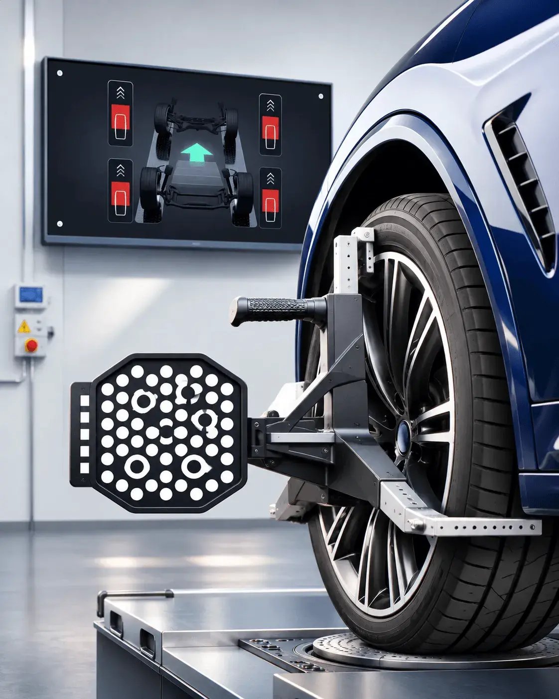
Wheel alignment combines physical sensors, vehicle positioning, and screen-based instructions. In line with embedded UX design principle 1, the interface must support the task as it occurs in the workshop.
Creative Navy calls the resulting principle performance in reality: performance is concrete and condition-dependent, and it is evidenced under operational constraints rather than assumed from controlled demonstrations. Performance in reality is therefore not a claim about how an interface should behave in the abstract. It is a question of whether the system performs in the place and circumstances where someone actually depends on it.
Principle 2: Design for Perception at the Actual Viewing Distance
A 14 px label is not inherently legible or illegible.
Legibility is an angle at the eye, not a pixel count. What the eye receives depends on the physical height of the characters relative to the viewing distance. Display ergonomics guidance in the ISO 9241 series expresses this as minutes of arc, where one minute of arc is 1/60 of a degree of visual angle. For Latin characters, 16 minutes of arc is the minimum, with 20–22 minutes of arc usual.
Take one example. Assume capital height is about 70% of the font size, typical of sans-serif typefaces. On a 7-inch 1024×600 panel, 28 px text gives capitals about 2.9 mm high. At 2 m, that subtends about 5 minutes of arc, under a third of the 16-arcminute minimum.
On that panel, text needs to be roughly 90 px to reach 16 minutes of arc at 2 m. Put the same 28 px text on a 43-inch 1920×1080 screen and the capitals are about 9.7 mm high, giving about 17 minutes of arc at 2 m. The same pixel rule therefore passes on one display and fails on another.
Size type from distance and pixel density, then check it on the hardware.
Real conditions take more away. Glare from reflected light reduces contrast. Workshop lighting and reflective surfaces affect readability, and vibration blurs display content at the pixel level. A contrast ratio checked indoors says little about how the same screen reads in direct sunlight.
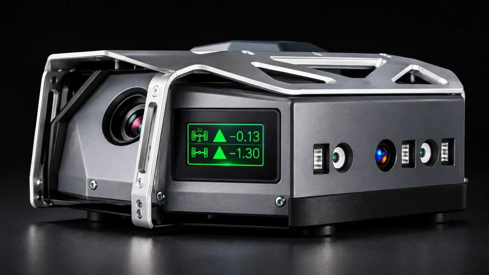
A compact embedded display makes the relationship between screen size, viewing distance and information legibility especially important.
On the hybrid-electric vessel control system legacy interface, low-contrast icons were hard to read in bright daylight. The reflective workshop surfaces in car repair shops created a similar perceptual constraint.
Treat the degraded condition as the baseline. Important state should be redundant across cues that can degrade independently, such as position, icon form and colour. If one cue becomes harder to perceive, the others still carry part of the meaning.
At the calibration equipment, the central design decision was to prioritize unambiguous state communication over information density on all three devices. The team accepted less information on each screen in exchange for one reading logic across the system.
Principle 3: Treat Touch and Physical Interaction as Part of UX Design
Interaction is physical. Touch, buttons, rotary controls, knobs and switches are operated with different levels of precision, sometimes with gloves or wet hands, sometimes at the edge of reach, and sometimes when an accidental activation has consequences.
The physical device is part of the interaction model. The interaction model, therefore, cannot be designed independently of the physical mechanism through which interaction occurs.
On an embedded touchscreen, touch targets need to be specified in millimeters, not pixels. A 48 px target is about 7.2 mm wide on a 7-inch 1024×600 display and about 11.9 mm on a 21.5-inch 1920×1080 display. The difference matters because the same pixel count produces a different physical target.
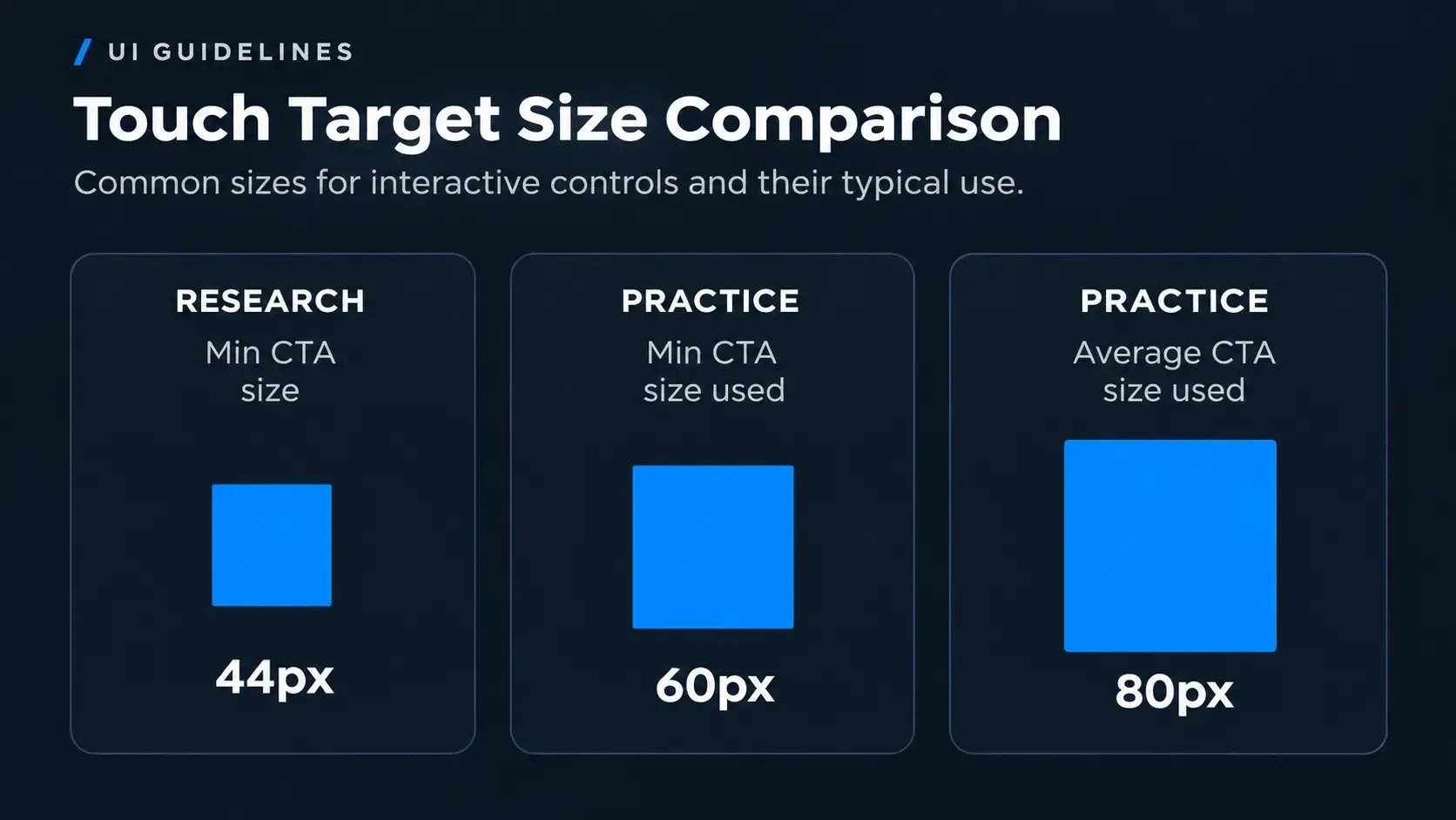
Touch target dimensions compared: 44 px, 60 px and 80 px. Larger targets can improve accessibility and reduce the precision required of the user.
For a room controller, targets followed ergonomics research by Colle and Hiszem: at least 13 mm, with accuracy improving only up to about 22 mm. The controller was a 4-inch round 480×480 px touchscreen mounted at 140 cm. It was used by technically confident professionals as well as elderly users with limited dexterity.
The previous interface relied only on swiping through ten numbered pages. Users could need up to ten swipes to reach a function, and the swipe lagged because of the microcontroller's limited processing power. We treated touch lag, symbol limits and colour depth as design parameters from the start. Navigation moved to a dashboard and a menu reachable from anywhere, and gesture-dependent patterns were ruled out where the hardware could not run them fluidly.
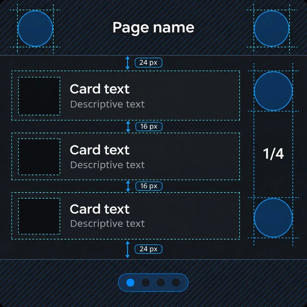
A touch interface layout showing how control dimensions, spacing and separation can be considered together rather than treating each button in isolation.
The lesson is clear: patterns that assume smartphone fluency fail on hardware that cannot deliver it.
Principle 4: Design for Divided Attention and Compressed Time
The operator is rarely only using the interface. They may be driving, monitoring machinery, performing a procedure, repairing something, watching another display, talking, moving or responding to an abnormal condition. The question is how much attention the interface can reasonably demand.
Road safety evidence gives a useful reference point. Klauer et al. found that glances away from the forward roadway totaling more than 2 seconds increase near-crash and crash risk to at least twice that of normal driving. NHTSA's 2013 visual manual driver distraction guidelines recommend, for cars, keeping single glances away from the road to 2 seconds or less and total eyes-off-road time per task to 12 seconds or less. In Qt’s own review of 44 real HMI designs across five industries, the automotive interfaces that scored highest were built for brief interactions that do not compete with driving.
Those guidelines were written for cars, so their use here is by analogy.
The same principle appears in a different setting on an e-bike display. On an e-bike display, warnings had been layered onto screens after the primary layout was set. The warning architecture was rebuilt structurally. Eye tracking with 5 participants on the same real routes showed average glance duration falling from 4.32 seconds to 1.89 seconds, with glances per kilometer falling by 18%.
The response is to move retrieval from reading to recognition, so critical state can be confirmed in a single brief glance without searching. The car research gives a useful comparison point, but the e-bike context is closely analogous rather than identical.
Time pressure adds another constraint. As pace rises, each interaction gets less time. At the calibration equipment, one extra second spent confirming a measurement state could accumulate across the calibration sequence and across a full day's queue. An inefficiency tolerated at low pace becomes an error risk at peak pace, so design for the worst-case interaction rate, not the typical one.
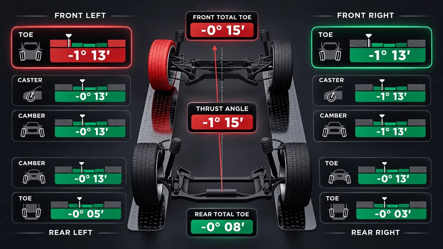
Following embedded UX design principle 4, this wheel alignment dashboard combines a spatial vehicle model with prominent measurements and status colors to support rapid interpretation during a physical task.
Creative Navy documents this failure pattern as the interface gets harder when pressure rises. Physical environment degradation, divided attention and temporal compression raise the cognitive cost of using the interface at the same moment that the cost of the task rises.
Principle 5: Make System State Perceivable
The operator needs to know what is happening, what state the system is in, whether something is changing, whether something is wrong, what needs attention and what they can do. The interface has to expose those changes at the rate at which the system itself changes.
On embedded devices, displayed state can drift from actual state. In the room controller, animation timing was aligned with the firmware's update intervals so the display did not drift from the real thermal values. Without that alignment, a display can show a state the system has already left.
The hybrid-electric vessel control system sensors update rapidly, batteries follow slower cycles and generators respond to changing load. One screen therefore risked reading as unstable or contradictory. A grid structure aligned the cadences so captains perceived one system.
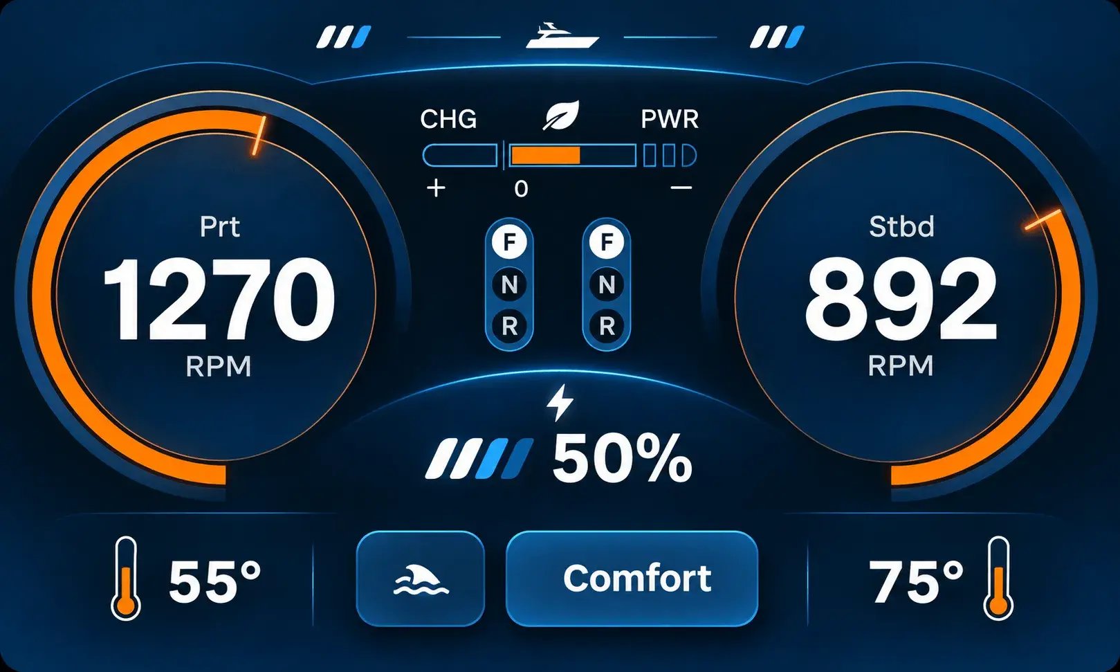
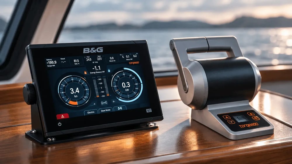
A marine propulsion dashboard brings engine speed, charge level and operating mode into a single view, making key system states visible at a glance.
In a controlled experiment with 24 participants, key energy states were identified 50% faster with the new interface than with the legacy one. Eye tracking during sea trials with 7 subjects also measured fewer glances during maneuvers.
Designing system state around operators' decisions is the subject of the companion article on human–machine interface (HMI) design.
Principle 6: Design for the Non-Nominal Environment
Real systems do not spend all their time in their ideal state.
Design for errors, warnings, unexpected states, degraded operation, recovery, temporary loss of information and uncertain state. A degraded mode is continued operation under reduced capability, caused by a faulted component, lost input, lost connection or an operating condition beyond designed parameters.
In the room controller, delayed sensor readings were shown calmly and without ambiguity. Contradictory values were shown explicitly rather than suppressed, and calibration faults surfaced as a named state. Heating-unit alerts were primary, while minor notifications, such as an open window, were secondary.
The hybrid-electric vessel control system likewise communicated delayed or contradictory sensor readings without creating unnecessary alarm. The important point is not to hide uncertainty, but to communicate it without making an expected condition look like a new failure. The interface has to distinguish between a condition that needs attention and a condition that needs to be represented accurately during ordinary operation.
Principle 7: Test Under the Conditions of Use
A prototype on a designer's screen is not enough. The same screen can be clear in a review and fail when the person who depends on it is standing several meters away, wearing gloves, moving around equipment or working through an abnormal condition. A review of screenshots or design files cannot reveal failures that only appear at distance, in glare, with gloves, under vibration or during a fault.
An embedded interface should be evaluated under the conditions in which it will actually be used.
Test:
-
on the actual hardware
-
at the actual viewing distance
-
under realistic lighting
-
with realistic input, including gloves
-
under realistic workload
-
with representative users
-
where possible, under representative abnormal conditions
The same logic applies in regulated fields. For medical devices, the FDA’s human factors and usability engineering guidance recommends that manufacturers design for the intended users, uses, and use environments, to minimize use errors and the harm they can cause.
At the calibration equipment, research covered 14 technicians across 5 workshops. Three structural variants of the embedded display were produced, and high-fidelity prototypes were tested under conditions reproducing workshop lighting and viewing distances rather than at a desk.
Calibration time fell from 18 to 12 minutes per vehicle, measured by the equipment manufacturer across 8 production deployment locations. It reports deploying the system without onboarding training. The relevant evidence was gathered in the environment in which the interface had to work, rather than inferred from a desk review. The same approach is described in Beissbarth's calibration equipment.
The e-bike manufacturer tested 10 participants riding for 3 days each on routes in Munich and the surrounding countryside. Warning-related issues made up about 30% of the issues needing user intervention before the redesign and none afterward, using the same method, and were still absent in a retest two years later. Eye tracking with 5 participants on the same real routes showed average glance duration falling from 4.32 seconds to 1.89 seconds, with glances per kilometer falling by 18%.
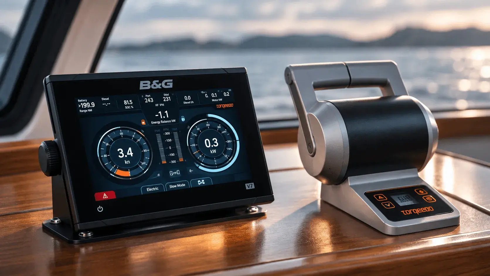
Marine controls, in their operating context, show why embedded interface evaluation must consider the physical display, adjacent controls, and the surrounding environment.
The hybrid-electric vessel control system measured glance counts during manoeuvres with eye tracking during sea trials with 7 subjects and found fewer glances.
The important point is when this testing happens. It belongs inside design, while the design can still change. Testing is not a final inspection of a finished screen. It is evidence used to decide what should change next.
That keeps the evidence close to the design decisions that produced the interface.
Conclusion: The Environment is Part of the Interface
The environment is part of the interface. The interface, the device and the operating environment form one interaction system, and performance depends on how those layers behave together where the system lives.
Once this is understood, many apparent screen problems become interaction problems instead. A screen that only works under controlled conditions is not evidence that the embedded interface works.
Taken together, these UX design principles and UI design principles point to one conclusion: an embedded touchscreen has to be designed and judged where it is used.
Once an interface can be perceived and operated where it lives, the next question is what it helps someone decide. That is the subject of the companion article on human–machine interface (HMI) design. The physical conditions establish whether the information can be used; the next problem is what that information should help the operator understand and do.