
Published On
Sep 4, 2026
Read Time
17 mins

I design user interfaces for products used in a range of contexts, from desktop applications to embedded devices like Medical monitors, industrial control panels, and screens people use to do a job. Over the past year, I’ve worked across different types of products and have used AI almost every day as part of my design process. It has changed how I think about design, and I’ve changed my mind about it more than once.
AI is transforming the way designers do their jobs; however, it's not taking over the design process. The most useful approach is to leverage AI to accelerate ideation and exploration, and to use design tools to refine, validate, and hand off when the product is ready for production.
Here’s my journey with AI in the design workflow, including the parts I got wrong.
Will AI Replace UX Designers?
No. AI is replacing specific tasks inside UX work. It is not replacing UX designers.
But the question is fair, and it is one designers are still debating. AI can generate interfaces in seconds, explore multiple design directions, and speed up early-stage design work. Yet research and practice show that experienced designers don't view AI as a replacement for the design process. Instead, they see it as a collaborator that accelerates exploration and helps designers think differently, while human judgment remains essential to making design decisions.
Nielsen Norman Group's State of UX 2026 puts it more bluntly. If you are just slapping together components from a design system, you are already replaceable by AI. What is not easy to automate is curated taste, research-informed contextual understanding, critical thinking, and careful judgment.
AI is highly relevant to UX designers, so much so that after a year of trial and error, I still use it in every project. The most valuable lesson I learned is that AI will not replace my role, but it is changing how I use different tools throughout the design process.
The Excitement Was Real
When AI started becoming part of the design process, it felt like everything changed overnight.
All of a sudden, building a UI didn't start with a blank canvas. It started with a prompt. AI could create screens, user flows, and product ideas in seconds that would take hours to build. It was easy to see why so many designers were getting excited.
Early research by UX and industrial designers shows that generative AI is becoming a valuable creative partner, especially for ideation and concept exploration. The same research also highlights an equally important issue: the degree of agency and creative control designers feel is a key factor in their level of trust in AI as part of their workflow.
I was probably just as excited as anybody else. I wanted to try out everything: Claude Design, Figma Make, Lovable, and almost every new tool that promised to make UI design faster.
And honestly, it felt amazing.
I could describe an idea with a couple of prompts, and in a few seconds I had something on my screen. It wasn't perfect, but it was more than enough to start a conversation, share an idea with the team, or explore different user flows before opening Figma. To someone who spends most of the day solving design problems, that felt like a big shift.
In Figma's State of the Designer 2026 survey of 906 designers, 91 percent said AI tools improve their designs and 89 percent said they work faster. The enthusiasm is real and it is well founded.
What Parts of UX Can AI Do Right Now?
AI is most valuable before the design work really begins. Before opening Figma, before creating components, and before making design decisions, there is a stage where the problem is still unclear. There are many possible directions, lots of questions, and no obvious answer yet. This is where AI has the biggest impact.
Today, AI is usually the first place I go when I start a new project. Tools like Claude Design and Figma Make have become an important part of my workflow, especially during the early stages.
If I had to describe my workflow today, I would split it into two parts: exploration and production. I will come back to the second one, because that is where things changed the most.
In the exploration phase, I haven't made any design decisions yet. I'm trying to understand the problem, explore different scenarios, gather ideas, and ask better questions.
At first, I was using AI to generate complete UI screens because I was curious to see how far it could go. Over time, I stopped doing that and moved AI to the work that comes before the screens:
-
Brainstorming and feature exploration;
-
Exploring different user flows;
-
UX writing;
-
Organizing documentation;
-
Preparing quick demos of even small functionality to better communicate my case with the team.
Instead of spending hours creating different concepts, I can quickly compare multiple ideas, challenge my own thinking, and decide which direction is worth exploring before I start designing.
Where AI Starts Falling Short
The role of AI in UI/UX design decreases the closer you get to production. I don’t believe UX designers can use AI for anything that decides the product: which direction is worth building at all, how an interaction should behave, and everything from refinement through to handoff. That is the second half of the workflow, and it is where my answer to whether AI will replace UX designers comes from.
Research shows that designers derive the most value from generative AI in early-stage ideation and exploration, while human expertise becomes increasingly important as projects progress toward refinement, evaluation, and implementation.
At this stage, the challenge is no longer about generating another interface. It's about making the right design decisions. The UI that AI generates doesn't look bad, but my questions become very different.
I'm no longer asking: "Design a screen for..." Instead, I'm asking:
-
Does this behavior align with our UX patterns?
-
Is this interaction right for our users?
-
Does this solution fit our design system?
-
Is it compatible with our team's technical constraints?
As UX designers, we spend most of our time making decisions that aren't visible in a screenshot. Those decisions shape the experience, create consistency across the product, and determine whether a design is ready for production.
Designers in other high-stakes fields describe the same split. A healthcare UX team recently made nearly the same argument: AI automates ideation, not judgment, and the gap between the two is widest wherever a design error can reach a real person. Embedded devices fall firmly within that category. In a previous article, my colleague Antti made the point that AI alone cannot solve embedded UI design, and I find myself agreeing with him.
There’s also a second problem, and it took me longer to see.
After using AI for a while, I started noticing that many of the generated interfaces looked familiar. They were clean and neat, but they also felt very similar and generic.
Without enough product context, AI naturally relies on design patterns that work well in many situations. It learns from common examples and generates interfaces that work for everybody.
The challenge is that products aren't built for "everyone." Every product has its own users, technical constraints, platform requirements, and design language. Those things rarely appear in a prompt.
That's where I believe UX designers create the most value. Generating an interface is becoming easier every day. However, making the right product decisions is still a very human process.
What I Learned: Design Systems and AI
At one point, I thought I had found the missing piece that could help me bridge the gap between exploration and production with AI. If AI could understand our Design System, surely the results would be much more relevant.
So I connected our Design System and expected the generated UI to be much closer to our actual product.
And it did improve. The screens looked more consistent, and the components were much closer to what we were already using. But after working with those designs, I started noticing that AI wasn't only using our Design System; it was also filling in the gaps.
It created new components that didn't exist and suggested interaction patterns we had never designed. Sometimes it introduced layouts that looked reasonable, but they weren't part of our product.
None of these changes looked obviously wrong. In fact, some of them looked quite good. But they weren't "us".
So I spent hours reviewing the generated designs, removing unnecessary elements, and cleaning up the files before I could continue designing.
I realized I stopped asking, "How fast did AI generate this?" and started asking, "Did it actually save me time?"
A Concrete Example of AI Working With a Design System
My expectation was that if AI had access to our components, colors, and patterns, the generated UI would follow them exactly. But when I looked at the details, I noticed a few differences that were actually important for our product.
For instance, the examples below show some of the visual differences between the AI-generated output and the design system, including incorrect tokens, Icons, components, and missing elements. Beyond these visible differences, there are also many hidden decisions around spacing, flows, interaction patterns, and component states that don't follow our guidelines, and that I didn't have full control over.
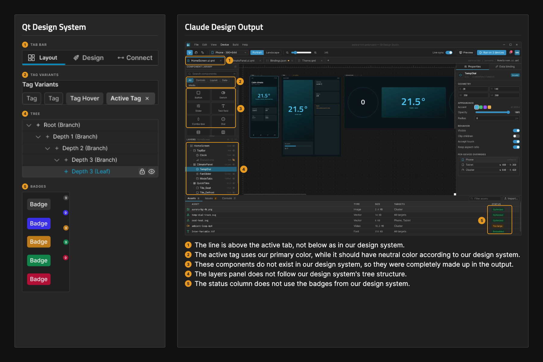
Figure 1 - Qt design system on the left and Claude Design output on the right. There are clear instances where Claude interprets the design system in undesirable ways or invents components that do not exist.
In Figure 1, you can see some of the discrepancies between our design system and the AI output. These are small details, but they matter when you are working on a real product. The AI knew our components and our color tokens, but it didn't always know why we use them in a particular way.
That was an important lesson for me. Connecting a Design System can give AI guardrails, but it doesn't automatically make the output production-ready. I still need to review the decisions, verify the patterns, and ensure the final design actually works for our users on our hardware in the environment where the device will be used.
A Design System is More Than a Component Library
The experience of integrating our design system into AI completely changed how I think about design systems.
A design system isn't just a library of components. It's the result of hundreds of design decisions made over time. Every component exists for a reason, and every pattern reflects product requirements, technical constraints, accessibility considerations, and thousands of conversations between designers and developers.
AI can recognize those components and assemble them into interfaces that look very convincing. But understanding why they exist and when they should or shouldn't be used is exactly what separates a first idea from a production-ready design that results from deliberate decisions.
I still start almost every project with AI. But I no longer expect AI to finish the project for me. Not because the visuals aren't good, but because I’ve learned that beautiful screens are only one part of a successful product. The decisions behind those screens matter far more.
The Missing Ingredient is Context
Throughout this experience, I realized that one of the biggest challenges with AI wasn't generating interfaces; it was providing enough context and defining UX patterns.
Every new conversation started from almost zero. I had to explain the product, the platform, the constraints, and the expectations before AI could generate anything relevant.
For this reason, I found the Qt GUI Design Skill so interesting. Even though it is built for developers, it helps you provide context and boundaries for the desired design through a set of questions, and it applies named design principles before returning any UI. So, instead of teaching the AI everything from scratch each time, the skill already provides some context.
It feels very different from writing a generic prompt, and it gets closer to capturing the complexities of designing for real-world devices. If I'm designing for embedded systems, I want the AI to take the target hardware into account. If I'm designing for automotive, I want it to understand the expectations and constraints of automotive interfaces. If I'm working on a medical device, I want the conversation to start with the reality of a healthcare practitioner helping a patient get better. Without having to feed all of this into the prompt every single time.
The more relevant the context is, the more relevant the ideas will be.
Qt GUI Design Skill, and other similar skills, still do not replace the designer’s expertise. Indeed, they are explicitly built for teams of developers who don't have the possibility to work with UX designers. Yet they make conversations with AI much more meaningful.
Another Experiment
When I became curious about how much difference the Qt GUI Design Skill would actually make, I tried a simple experiment in Claude. I gave the exact same prompt twice.
The first time, I used a regular prompt: "Design a bedside patient monitor used in an ICU."
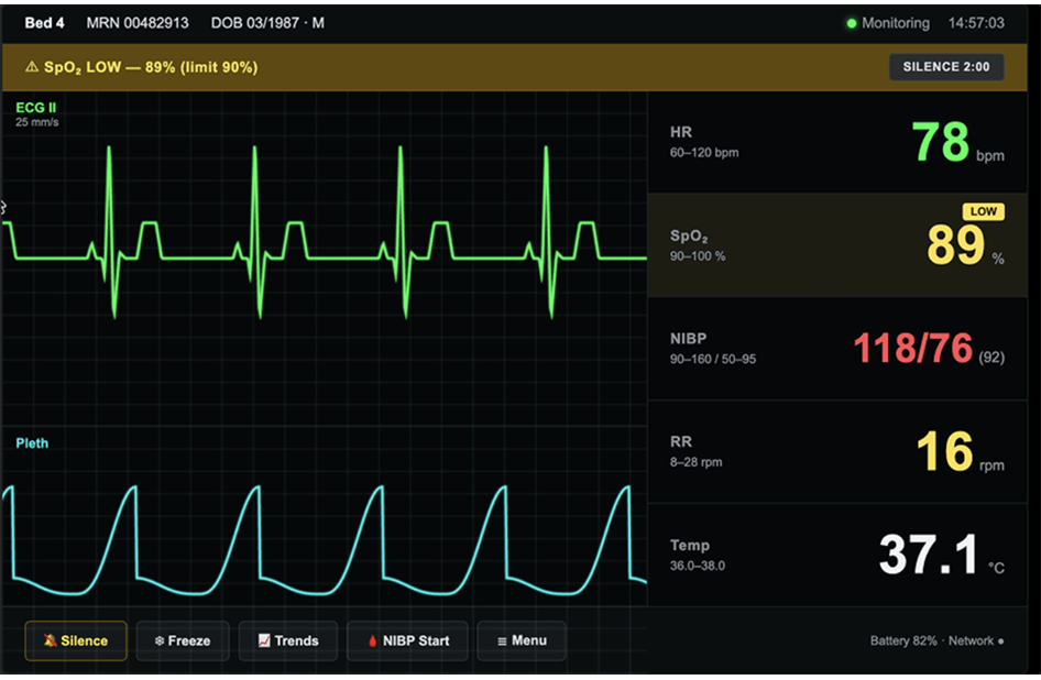
Figure 2 - The ICU bedside patient monitor user interface created with AI without the help of Qt GUI Design Skill looks clean and modern, yet it is generic and does not prioritize clinical UX needs.
The result looked clean and modern. You can see in Figure 2 that the UI has a clear layout, strong contrast, large numbers, bright colors, and a modern dashboard feel. It does indeed feel polished and easy to look at.
But it is also generic. And honestly, the choices made are probably better suited to a consumer dashboard than a medical monitor. In a clinical setting, safety, alarm clarity, consistency, and quick scanning are more important than visual impact.
So, it looked genuinely good, but it did prioritize aesthetics over clinical UX needs.
The second time, I ran the exact same prompt again, this time with the Qt GUI Design Skill enabled. Before generating anything, Claude asked questions about the product and the environment.
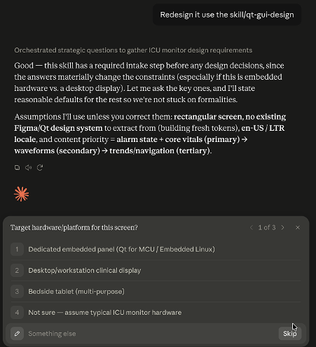
Figure 3 - Before starting to work on the user interface, Qt GUI Design Skill asks questions to provide context for the design. For example, it asks about the target hardware and platform.
The final design reflected the additional context. The information hierarchy was clearer, the layout felt more intentional, and the interface looked much closer to a design for a real embedded medical device.
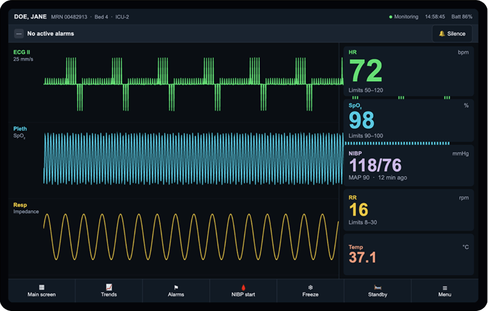
Figure 4 - The ICU bedside patient monitor user interface, created with AI and using Qt GUI Design Skill, takes into account medical device UX principles, providing a stronger starting point than the generic UI in Figure 2.
Looking at Figure 4 from a UI perspective, you can notice:
-
Consistent colors: Each vital has its own color, keeping alarm colors clear and meaningful.
-
Consistent layout: All vital signs follow the same visual structure, making the screen easier to scan.
-
Waveforms included: Each value is shown with its waveform for better visual context.
-
Clear alarm bar: The alarm status is always visible and easy to understand.
-
Better controls: Large, consistent controls are easier to see and use with gloves.
-
Physical device framing: The UI is designed within a fixed bezel, with proper spacing and contained waveform areas.
These aren’t just visual or aesthetic changes; they address established healthcare UX principles such as clear alarm hierarchy, consistent color semantics, patient identification, error prevention, accessibility, and safe interaction under time pressure.
The skill helped bring the design closer to the conventions and safety expectations of medical-device interfaces, while still requiring clinical and UX/UI review before final handoff.
The table below highlights the key medical-device UX principles that the skill-guided design improved.
| Medical Device UX Principle | Without Qt GUI Design Skill | With Qt GUI Design Skill |
| Alarm colors | Normal values are shown in alarm colors, making everything look urgent. | Reserve red/yellow for actual alarm priority; use stable parameter colors for normal vitals. |
| Alarm hierarchy | Multiple warning colors compete for attention. | Make the actual alarm visually dominant and keep parameter colors separate from alarm status. |
| Patient ID | Relies mainly on MRN (Medical Record Number) and DOB (Date Of Birth). | Show patient name + bed + unit prominently for faster bedside identification. |
| Waveforms | Some values appear without enough context to validate them. | Pair every numeric with its waveform, including respiration. |
| Color accessibility | Color is doing too much of the communication. | Combine color with position, labels, and icons so meaning doesn’t depend on color alone. |
| Alarm controls | Multiple/competing silence controls create ambiguity. | Use one clear Silence control with a large, consistent touch target. |
| Touch targets | Controls are cramped for gloved or off-axis interaction. | Use larger targets and a full-width bottom action bar. |
| Visual polish | ECG trace is clipped and a stray glyph appears at the edge. | Clean up alignment, clipping, spacing, and rendering before handoff. |
| Signal fidelity | Some waveforms don’t appear consistent with their displayed values. | Validate ECG/pleth waveforms with clinical input and correct artifact representation. |
| Overall validation | Design improvements don’t automatically make the monitor clinically valid. | Conduct UX/UI + clinical review and refinement before final handoff. |
For me, that was the biggest takeaway. The Qt GUI Design Skill didn't just change the UI; it changed the conversation that happened before the UI was generated.
That doesn't mean the design was production-ready, but it gave me a much stronger starting point than a generic UI.
Then I Started Losing Control Over My Designs
Even with the Qt GUI Design Skill in my workflow, I quickly realized there was another change I didn't expect. The more I relied on AI, the less I felt I was actually designing.
At first, it didn't bother me. But after a while, I noticed that I was spending less time making design decisions and more time writing and refining prompts.
Some days, AI understood exactly what I wanted. Other days, I spent hours rewriting the same prompt, changing one sentence, adding more context, removing details, and trying to steer a misdirected design output in the right direction with words.
And sometimes, just when I felt I was getting closer... I hit my usage limit.
That was the moment I realized something had changed in a way I didn’t like. I wasn't designing anymore.
As designers, we enjoy making small decisions because that’s where creativity happens and where we feel most connected to our work. The same Figma survey I cited above shows that designers rank creative freedom as the single biggest contributor to job satisfaction. 87% of the respondents said creative autonomy helps them do their best work.
At this stage of my AI journey, what I was experiencing was more similar to what Nielsen Norman Group calls “AI fatigue.” So I changed my workflow again. I went back to my design tools, not because AI wasn’t useful, but because that’s where I knew I could make decisions.
How Can I Use AI in My UX Workflow?
The best way I could find to use AI in my UX workflow is to clearly identify where the line sits between AI tools and traditional UX tools.
I said before that I split my workflow into two: exploration and production. AI tools belong to the former stage, while UX tools still dominate the latter. They are not competing with each other. They’re solving different problems.
Several studies support this view. Researchers found that designers don’t want AI to design the product for them. They want AI to help them move faster, particularly in the early stages of a project, while keeping control over the final design.
That’s how I use AI in my UX workflow. On the exploration side, AI helps me get started, explore a variety of ideas quickly, prepare documentation, and align with the team. On the production side, design tools help me build, iterate, validate ideas with real users, refine interactions, work within constraints, and prepare a design I can confidently hand off to development.
What is the Future of UX Design with AI?
If I look at the future of UX design with AI, I believe the best way to frame it is through the lens of a recent panel Qt hosted on designing for embedded applications: throughout the history of UX design, tools have changed enormously, while the fundamentals have not moved at all.
Great UX design is still a very human process. It’s built through observation, conversations with users, understanding business goals, working with technical constraints, and making hundreds of small decisions that shape the final user experience. That doesn’t happen in a prompt. It happens throughout the design process.
Once the exploration phase is done, ideas are clear, and the design starts becoming a real product, my priorities change. I'm no longer trying to generate more concepts and variations. I'm trying to make sure the design is implemented exactly as it was intended.
This is where traditional UX design workflows become especially important. After spending hours refining interactions, adjusting spacing, validating decisions, and polishing the experience, I don't want that work to be lost because my implementation prompts were unclear or insufficiently detailed.
Figma's 2026 AI report, built on more than 8,000 responses collected over three years, makes a similar point: AI can build almost anything, but what it cannot do is determine what is worth building. Ninety percent of respondents said design is at least as important as it was before AI, and that included 65 percent of developers.
So, Will AI Replace UX Designers?
No. And after more than one year exploring AI tools and capabilities, I don’t think that is an interesting question anymore. The interesting question is where you put AI in your UX design process, and what you refuse to hand over instead.
Today, my workflow feels very natural. AI helps me think. Design tools help me ship. Each tool has a different role. And together, they create a workflow that is both fast and reliable.
What has not changed is the part that was always the job: understanding who this is for, what it has to survive, and which of a hundred small decisions is the right one. That still happens outside the prompt.
Related Articles