# Delegate
When it comes to using models and views in a custom user interface, the delegate plays a huge role in creating a look and behaviour. As each item in a model is visualized through a delegate, what is actually visible to the user are the delegates.
Each delegate gets access to a number of attached properties, some from the data model, others from the view. From the model, the properties convey the data for each item to the delegate. From the view, the properties convey state information related to the delegate within the view. Let's dive into the properties from the view.
The most commonly used properties attached from the view are ListView.isCurrentItem and ListView.view. The first is a boolean indicating if the item is the current item, while the latter is a read-only reference to the actual view. Through access to the view, it is possible to create general, reusable delegates that adapt to the size and nature of the view in which they are contained. In the example below, the width of each delegate is bound to the width of the view, while the background color of each delegate depends on the attached ListView.isCurrentItem property.
import QtQuick

Rectangle {
    width: 120
    height: 300

    gradient: Gradient {
        GradientStop { position: 0.0; color: "#f6f6f6" }
        GradientStop { position: 1.0; color: "#d7d7d7" }
    }

    ListView {
        anchors.fill: parent
        anchors.margins: 20

        focus: true

        model: 100
        delegate: numberDelegate

        spacing: 5
        clip: true
    }

    Component {
        id: numberDelegate

        Rectangle {
            id: wrapper

            required property int index

            width: ListView.view.width
            height: 40

            color: ListView.isCurrentItem ? "#157efb" : "#53d769"
            border.color: Qt.lighter(color, 1.1)

            Text {
                anchors.centerIn: parent

                font.pixelSize: 10

                text: wrapper.index
            }
        }
    }
}
If each item in the model is associated with an action, for instance, clicking an item acts upon it, that functionality is a part of each delegate. This divides the event management between the view, which handles the navigation between items in the view, and the delegate which handles actions on a specific item.
The most basic way to do this is to create a MouseArea within each delegate and act on the onClicked signal. This is demonstrated in the example in the next section of this chapter.
# Animating Added and Removed Items
In some cases, the contents shown in a view changes over time. Items are added and removed as the underlying data model is altered. In these cases, it is often a good idea to employ visual cues to give the user a sense of direction and to help the user understand what data is added or removed.
Conveniently enough, QML views attach two signals, onAdd and onRemove, to each item delegate. By triggering animations from these, it is easy to create the movement necessary to aid the user in identifying what is taking place.
The example below demonstrates this through the use of a dynamically populated ListModel. At the bottom of the screen, a button for adding new items is shown. When it is clicked, a new item is added to the model using the append method. This triggers the creation of a new delegate in the view, and the emission of the GridView.onAdd signal. The SequentialAnimation called addAnimation is started from the signal causes the item to zoom into view by animating the scale property of the delegate.
GridView.onAdd: addAnimation.start()

SequentialAnimation {
    id: addAnimation
    NumberAnimation {
        target: wrapper
        property: "scale"
        from: 0
        to: 1
        duration: 250
        easing.type: Easing.InOutQuad
    }
}
When a delegate in the view is clicked, the item is removed from the model through a call to the remove method. This causes the GridView.onRemove signal to be emitted, starting the removeAnimation SequentialAnimation. This time, however, the destruction of the delegate must be delayed until the animation has completed. To do this, PropertyAction element is used to set the GridView.delayRemove property to true before the animation, and false after. This ensures that the animation is allowed to complete before the delegate item is removed.
GridView.onRemove: removeAnimation.start()

SequentialAnimation {
    id: removeAnimation

    PropertyAction { target: wrapper; property: "GridView.delayRemove"; value: true }
    NumberAnimation { target: wrapper; property: "scale"; to: 0; duration: 250; easing.type: Easing.InOutQuad }
    PropertyAction { target: wrapper; property: "GridView.delayRemove"; value: false }
}
Here is the complete code:
import QtQuick

Rectangle {
    width: 480
    height: 300

    gradient: Gradient {
        GradientStop { position: 0.0; color: "#dbddde" }
        GradientStop { position: 1.0; color: "#5fc9f8" }
    }

    ListModel {
        id: theModel

        ListElement { number: 0 }
        ListElement { number: 1 }
        ListElement { number: 2 }
        ListElement { number: 3 }
        ListElement { number: 4 }
        ListElement { number: 5 }
        ListElement { number: 6 }
        ListElement { number: 7 }
        ListElement { number: 8 }
        ListElement { number: 9 }
    }

    Rectangle {
        property int count: 9

        anchors.left: parent.left
        anchors.right: parent.right
        anchors.bottom: parent.bottom
        anchors.margins: 20

        height: 40

        color: "#53d769"
        border.color: Qt.lighter(color, 1.1)

        Text {
            anchors.centerIn: parent

            text: "Add item!"
        }

        MouseArea {
            anchors.fill: parent

            onClicked: {
                theModel.append({"number": ++parent.count})
            }
        }
    }

    GridView {
        anchors.fill: parent
        anchors.margins: 20
        anchors.bottomMargin: 80

        clip: true

        model: theModel

        cellWidth: 45
        cellHeight: 45

        delegate: numberDelegate
    }

    Component {
        id: numberDelegate

        Rectangle {
            id: wrapper

            required property int index
            required property int number

            width: 40
            height: 40

            gradient: Gradient {
                GradientStop { position: 0.0; color: "#f8306a" }
                GradientStop { position: 1.0; color: "#fb5b40" }
            }

            Text {
                anchors.centerIn: parent

                font.pixelSize: 10

                text: wrapper.number
            }

            MouseArea {
                anchors.fill: parent

                onClicked: {
                    if (wrapper.index == -1) {
                        return
                    }
                    theModel.remove(wrapper.index)
                }
            }

            GridView.onRemove: removeAnimation.start()

            SequentialAnimation {
                id: removeAnimation

                PropertyAction { target: wrapper; property: "GridView.delayRemove"; value: true }
                NumberAnimation { target: wrapper; property: "scale"; to: 0; duration: 250; easing.type: Easing.InOutQuad }
                PropertyAction { target: wrapper; property: "GridView.delayRemove"; value: false }
            }

            GridView.onAdd: addAnimation.start()

            SequentialAnimation {
                id: addAnimation
                NumberAnimation {
                    target: wrapper
                    property: "scale"
                    from: 0
                    to: 1
                    duration: 250
                    easing.type: Easing.InOutQuad
                }
            }
        }
    }
}
# Shape-Shifting Delegates
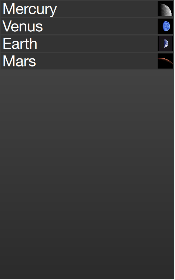
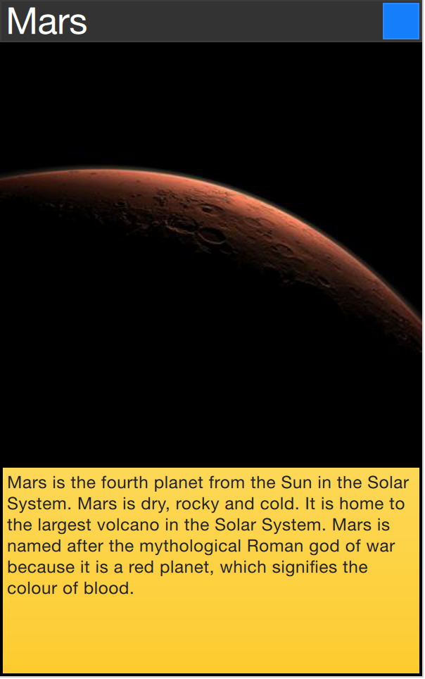
A commonly used mechanism in lists is that the current item is expanded when activated. This can be used to dynamically let the item expand to fill the screen to enter a new part of the user interface, or it can be used to provide slightly more information for the current item in a given list.
In the example below, each item is expanded to the full extent of the ListView containing it when clicked. The extra space is then used to add more information. The mechanism used to control this is a state expanded that each item delegate can enter, where the item is expanded. In that state, a number of properties are altered.
First of all, the height of the wrapper is set to the height of the ListView. The thumbnail image is then enlarged and moved down to make it move from its small position into its larger position. In addition to this, the two hidden items, the factsView and closeButton are shown by altering the opacity of the elements. Finally, the ListView is setup.
Setting up the ListView involves setting the contentsY, that is the top of the visible part of the view, to the y value of the delegate. The other change is to set interactive of the view to false. This prevents the view from moving. The user can no longer scroll through the list or change the current item.
As the item first is clicked, it enters the expanded state, causing the item delegate to fill the ListView and the contents to rearrange. When the close button is clicked, the state is cleared, causing the delegate to return to its previous state and re-enabling the ListView.
import QtQuick

Item {
    width: 300
    height: 480

    Rectangle {
        anchors.fill: parent
        gradient: Gradient {
            GradientStop { position: 0.0; color: "#4a4a4a" }
            GradientStop { position: 1.0; color: "#2b2b2b" }
        }
    }

    ListView {
        id: listView

        anchors.fill: parent

        delegate: detailsDelegate
        model: planets
    }

    ListModel {
        id: planets

        ListElement { name: "Mercury"; imageSource: "images/mercury.jpeg"; facts: "Mercury is the smallest planet in the Solar System. It is the closest planet to the sun. It makes one trip around the Sun once every 87.969 days." }
        ListElement { name: "Venus"; imageSource: "images/venus.jpeg"; facts: "Venus is the second planet from the Sun. It is a terrestrial planet because it has a solid, rocky surface. The other terrestrial planets are Mercury, Earth and Mars. Astronomers have known Venus for thousands of years." }
        ListElement { name: "Earth"; imageSource: "images/earth.jpeg"; facts: "The Earth is the third planet from the Sun. It is one of the four terrestrial planets in our Solar System. This means most of its mass is solid. The other three are Mercury, Venus and Mars. The Earth is also called the Blue Planet, 'Planet Earth', and 'Terra'." }
        ListElement { name: "Mars"; imageSource: "images/mars.jpeg"; facts: "Mars is the fourth planet from the Sun in the Solar System. Mars is dry, rocky and cold. It is home to the largest volcano in the Solar System. Mars is named after the mythological Roman god of war because it is a red planet, which signifies the colour of blood." }
    }

    Component {
        id: detailsDelegate

        Item {
            id: wrapper

            required property string name
            required property string imageSource
            required property string facts

            width: listView.width
            height: 30

            Rectangle {
                anchors.left: parent.left
                anchors.right: parent.right
                anchors.top: parent.top

                height: 30

                color: "#333"
                border.color: Qt.lighter(color, 1.2)
                Text {
                    anchors.left: parent.left
                    anchors.verticalCenter: parent.verticalCenter
                    anchors.leftMargin: 4

                    font.pixelSize: parent.height-4
                    color: '#fff'

                    text: wrapper.name
                }
            }


            Rectangle {
                id: image

                width: 26
                height: 26

                anchors.right: parent.right
                anchors.top: parent.top
                anchors.rightMargin: 2
                anchors.topMargin: 2

                color: "black"


                Image {
                    anchors.fill: parent

                    fillMode: Image.PreserveAspectFit

                    source: wrapper.imageSource
                }
            }

            MouseArea {
                anchors.fill: parent
                onClicked: parent.state = "expanded"
            }

            Item {
                id: factsView

                anchors.top: image.bottom
                anchors.left: parent.left
                anchors.right: parent.right
                anchors.bottom: parent.bottom

                opacity: 0

                Rectangle {
                    anchors.fill: parent

                    gradient: Gradient {
                        GradientStop { position: 0.0; color: "#fed958" }
                        GradientStop { position: 1.0; color: "#fecc2f" }
                    }
                    border.color: '#000000'
                    border.width: 2

                    Text {
                        anchors.fill: parent
                        anchors.margins: 5

                        clip: true
                        wrapMode: Text.WordWrap
                        color: '#1f1f21'

                        font.pixelSize: 12

                        text: wrapper.facts
                    }
                }
            }

            Rectangle {
                id: closeButton

                anchors.right: parent.right
                anchors.top: parent.top
                anchors.rightMargin: 2
                anchors.topMargin: 2

                width: 26
                height: 26

                color: "#157efb"
                border.color: Qt.lighter(color, 1.1)

                opacity: 0

                MouseArea {
                    anchors.fill: parent
                    onClicked: wrapper.state = ""
                }
            }

            states: [
                State {
                    name: "expanded"

                    PropertyChanges { target: wrapper; height: listView.height }
                    PropertyChanges { target: image; width: listView.width; height: listView.width; anchors.rightMargin: 0; anchors.topMargin: 30 }
                    PropertyChanges { target: factsView; opacity: 1 }
                    PropertyChanges { target: closeButton; opacity: 1 }
                    PropertyChanges { target: wrapper.ListView.view; contentY: wrapper.y; interactive: false }
                }
            ]

            transitions: [
                Transition {
                    NumberAnimation {
                        duration: 200;
                        properties: "height,width,anchors.rightMargin,anchors.topMargin,opacity,contentY"
                    }
                }
            ]
        }
    }
}
The techniques demonstrated here to expand the delegate to fill the entire view can be employed to make an item delegate shift shape in a much smaller way. For instance, when browsing through a list of songs, the current item could be made slightly larger, accommodating more information about that particular item.